WeWork
Meet
FrameWork
–
A design language that reflects WeWork’s unique balance of structure and flexibility.
WeWork builds structures that build community. More than just spaces, they program events, create virtual networks, foster personal connections and spark opportunities for members and colleagues alike. As global growth exploded, the brand recognized a need to re-align the visual identity to their purpose. We saw an opportunity to replicate the brand’s natural activities and behaviors – creating a visual metaphor for WeWork itself. “FrameWork,” the identity system that we created, is now being implemented globally.
Snap-to-fit
–
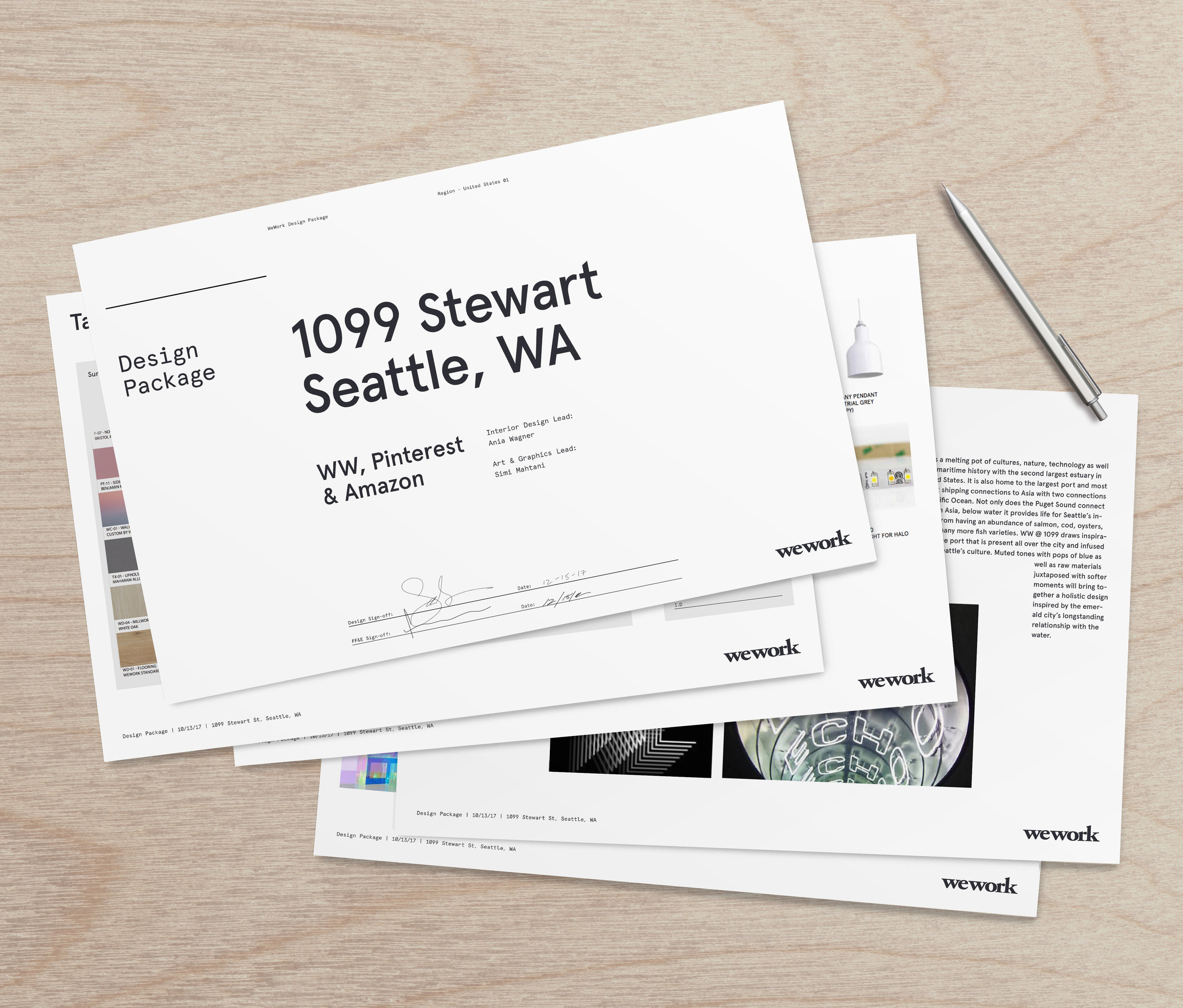
A responsive, hyper-functional design system that creates structure in any format, on any platform. Layout and hierarchy can be restructured nimbly and efficiently. WeWork represents the frame, the underpinning, the substrate that supports and empowers the content, members and communities to thrive.
The design is meant to feel intentionally ad-hoc, as if each piece is working around the next. We use layout, and an exaggerated indent, not just to convey a message but to imply space, creating a flexible floor plan of sorts.
Identity
–
Typography
–
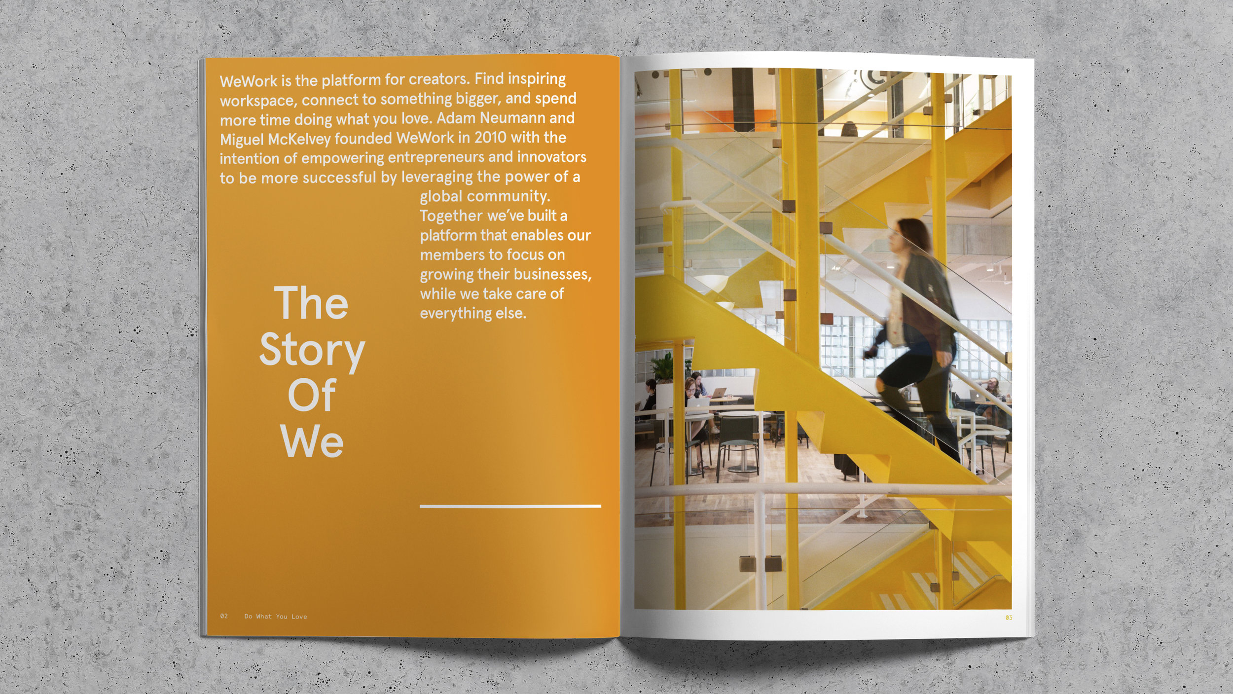
The brand font is Aperçu Pro Medium, a modern sans-serif with classical cues. It’s contemporary, refined, and functional, but full of character. It’s sturdy enough to be used as an everyday copy face, but interesting enough to hold attention at large display sizes. We use Aperçu Pro Mono for information like dates, time, and locations. In use we 'notch' body copy, creating a suggested space within the floorplan of our layout.


