Slate

A clean slate
–
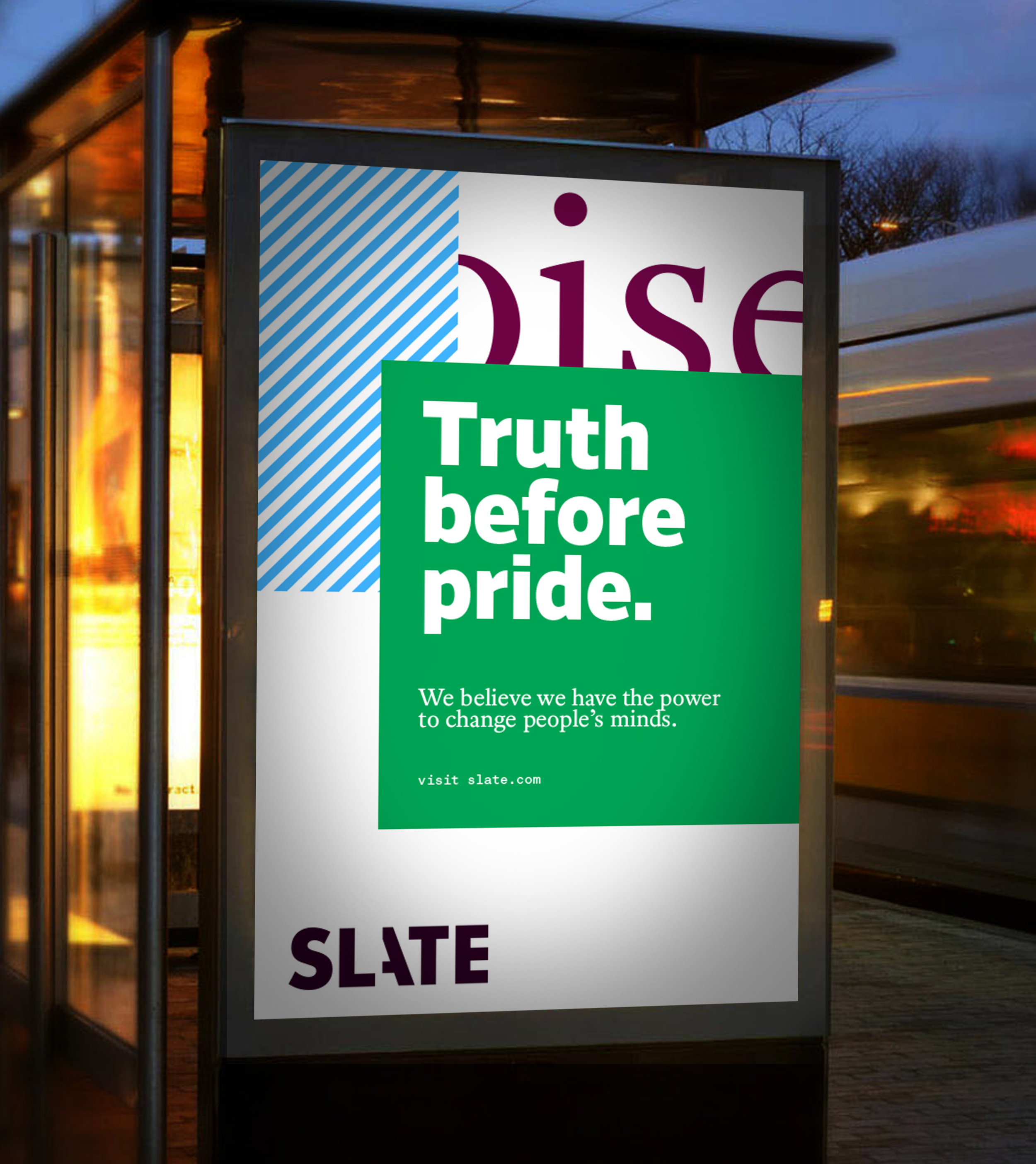
Visualizing Slate's story-making process.
As one of the pioneers of online journalism, Slate has maintained a consistent editorial tone that’s loaded with wit, curiosity and insight throughout its 22-year history. However, during that time the internet had evolved significantly whilst Slate’s visual expression hadn't. We were asked to bring Slate up-to-date with a brand identity that better represented the organization’s attitude and unique journalistic tone.
Our approach was to visualize Slate’s story-making process with a language that feels like sifting through the news, looking for hidden clues and cracking the code that blows open the case. The design system gives Slate a bolder typographic expression and tools to create bespoke key art for articles and podcast covers, resulting in a unique visual voice befitting the quality of the journalism.

The logo was cleaned up and reimagined, with a nod to the idea of discovery. The “A” is being revealed and uncovered, with a very slight gesture. The gesture expands to the language of the family of Slate products.


Article layout can range from straightforward and serious to more layered, complex and expressive.