Showtime
Illuminating Characters
–
Evolving Showtime to a streaming-first brand
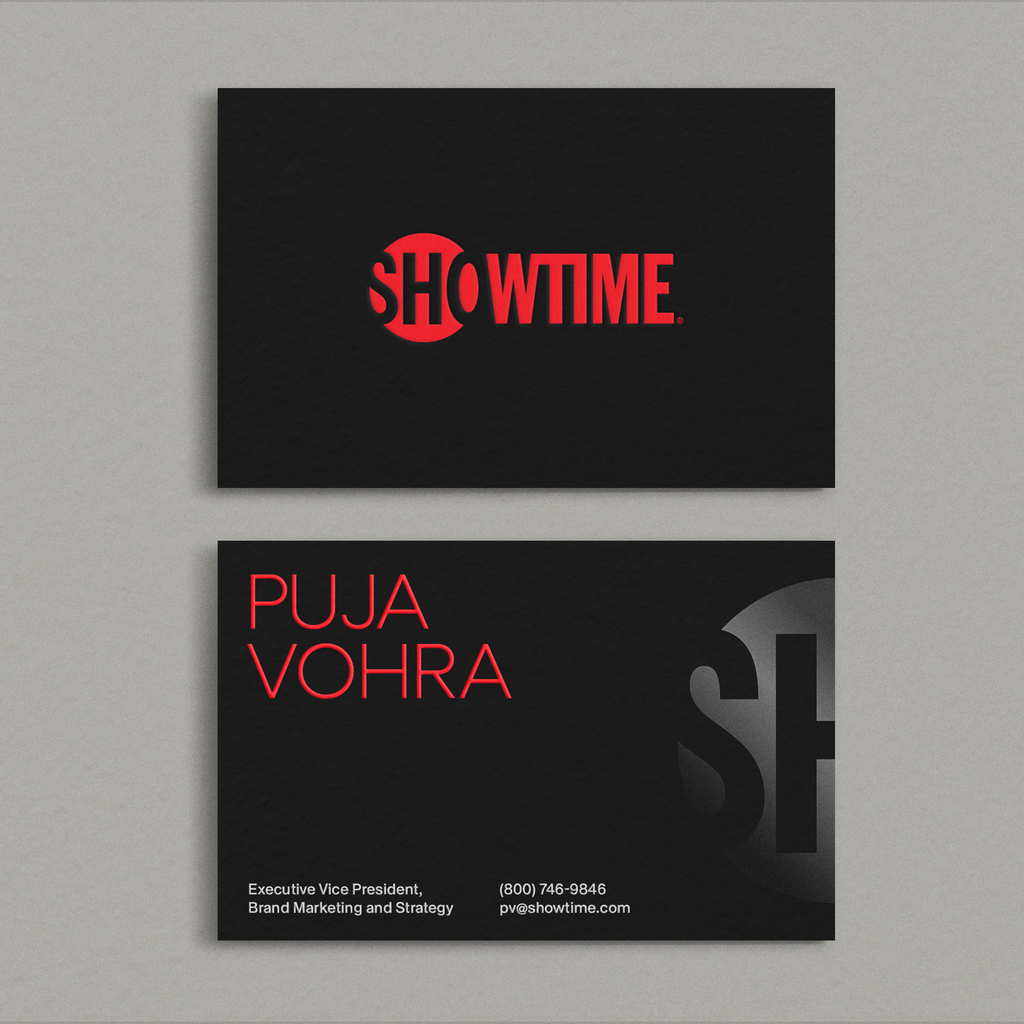
Known for boundary-pushing original series, films and docs along with a curated selection of movies and live-sports, Showtime needed to evolve their brand to reflect their ambition as a streaming-first platform. By distilling down to a few iconic brand signatures: color, typography and visual language of light - we built a nimble, functional and hyper-consistent identity system that unifies the viewer experience across streaming, the network, digital and social.

The Source
–
Showtime shines a light on daring, provocative and relevant stories and storytellers. Original shows and characters burn bright and leave a lasting impression. A visual and behavioral language of light became a through-line in both the design and voice.

“The visual language presents a modern, streaming-forward brand, yet still honors our decades-long heritage in premium entertainment.”
GARRETT WAGNER
SENIOR VICE PRESIDENT & EXECUTIVE CREATIVE DIRECTOR
SHOWTIME NETWORKS
Brand signatures
–
A single color, streamlined motion and clean, modern typography were key to making sure the brand shows up clearly and consistently wherever it travels.
The new brand mnemonic evolves key aspects of previous versions of the brand: light, color and sound but distills them into a simple, clear, streaming-friendly signature.
Audio by Antfood.

Showtime anywhere
–
Because content is so varied, the brand needed standards for consistency in placement, scale, and duration across all assets. The result is a unified visual, compositional, motion and typographic language no matter where or what viewers are watching.
“The Gretel process is both wonderfully exhaustive and remarkably efficient. They’re constantly striving to achieve better, deeper, more commercially impactful work.”
MICHAEL ENGLEMAN
CHIEF MARKETING OFFICER
SHOWTIME NETWORKS