POPL

Full Stack
–
A top-to-bottom brand for Copenhagen’s newest burger spot
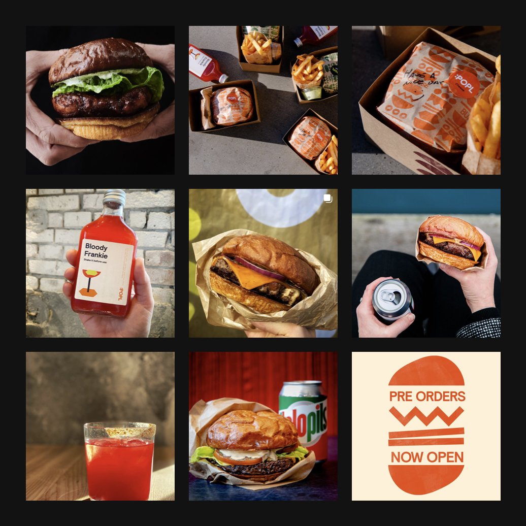
POPL is a neighborhood burger restaurant located by the water in the Christianshavn neighborhood of Copenhagen. Created by the team behind the renowned restaurant, noma, POPL is a place for friends and family to come together to share the joy of a well-crafted burger.
It’s a restaurant, and a brand, filled with warmth and a wink.
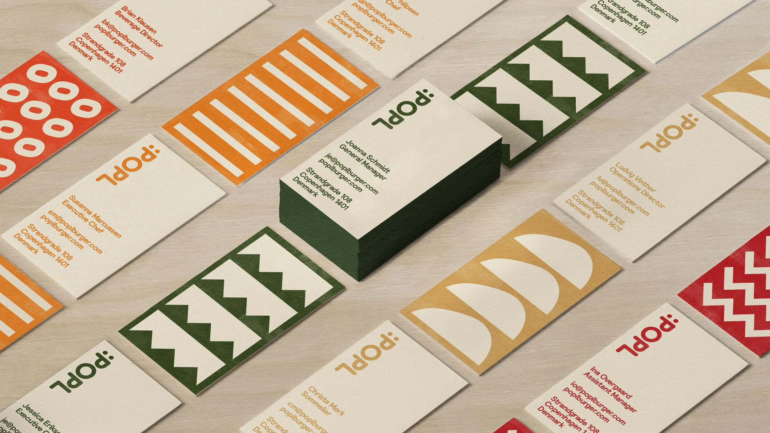
The graphic language is a play on the format of the burger itself. Type, image and abstracted graphic ‘ingredients’ stack on top of each other across packaging, signage, even in the space itself. Hidden within the wordmark is an emoji that acts as a shorthand for POPL: fun and delicious.
The POPL name derives from the Latin word “populus” meaning community of people. It’s an abridged translation of Poplar, a hardwood native to Denmark that’s both beautiful and affordable.

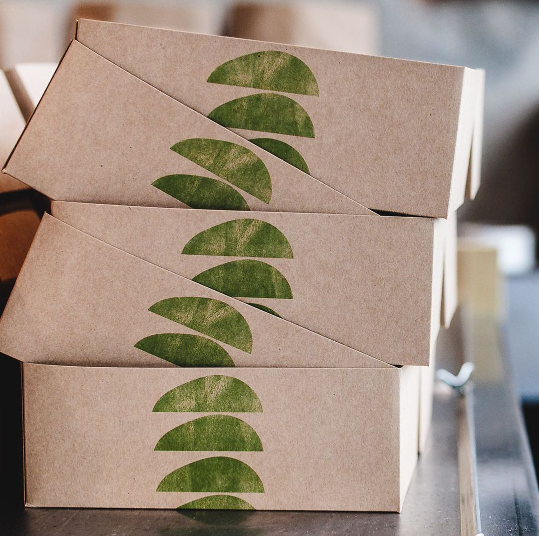
“The burger graphics are charmingly chunky and rendered in bright orange woodcuts, instantly evoking the craft that goes into every item on the menu.”


Interior Design & Photos by Spacon & X


