Philadelphia Art Museum
Philadelphia Front and Center
–
Infusing the texture of the city into an iconic institution
The Philadelphia Museum of Art is transforming to be more collaborative, engaging, expansive and future-focused. With a new strategic vision to “come down the steps and throw the doors wide open,” the aim is to invite more Philadelphians in, more often. And to extend that reach outward to local neighborhoods, national and global audiences alike.
The new brand is both a marker of change and a renewed commitment. It’s anchored in the museum’s heritage with custom-crafted typography and a revitalized griffin, but looks decidedly forward. It centers the city of Philadelphia by embracing its independent spirit. Visionary and welcoming, provocative and playful, it’s designed to dissolve the walls of the museum, invite all visitors in, and emanate its wide-ranging programming out into the world.
Along the way, the museum’s name shifted to what much of the city had already called it: Philadelphia Art Museum. It’s simple, casual and approachable. In short: PhAM.
An icon revived and redrawn
—
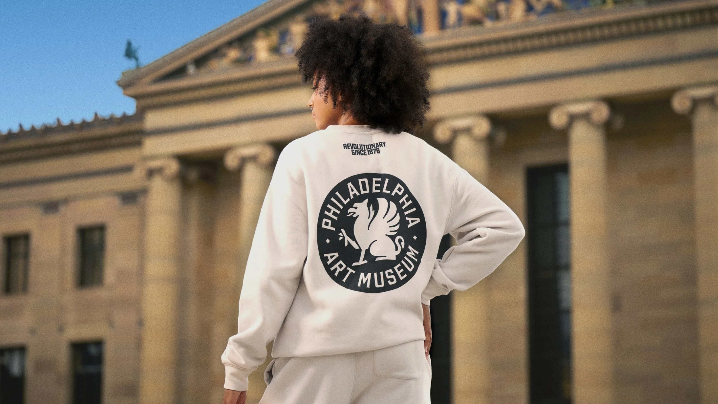
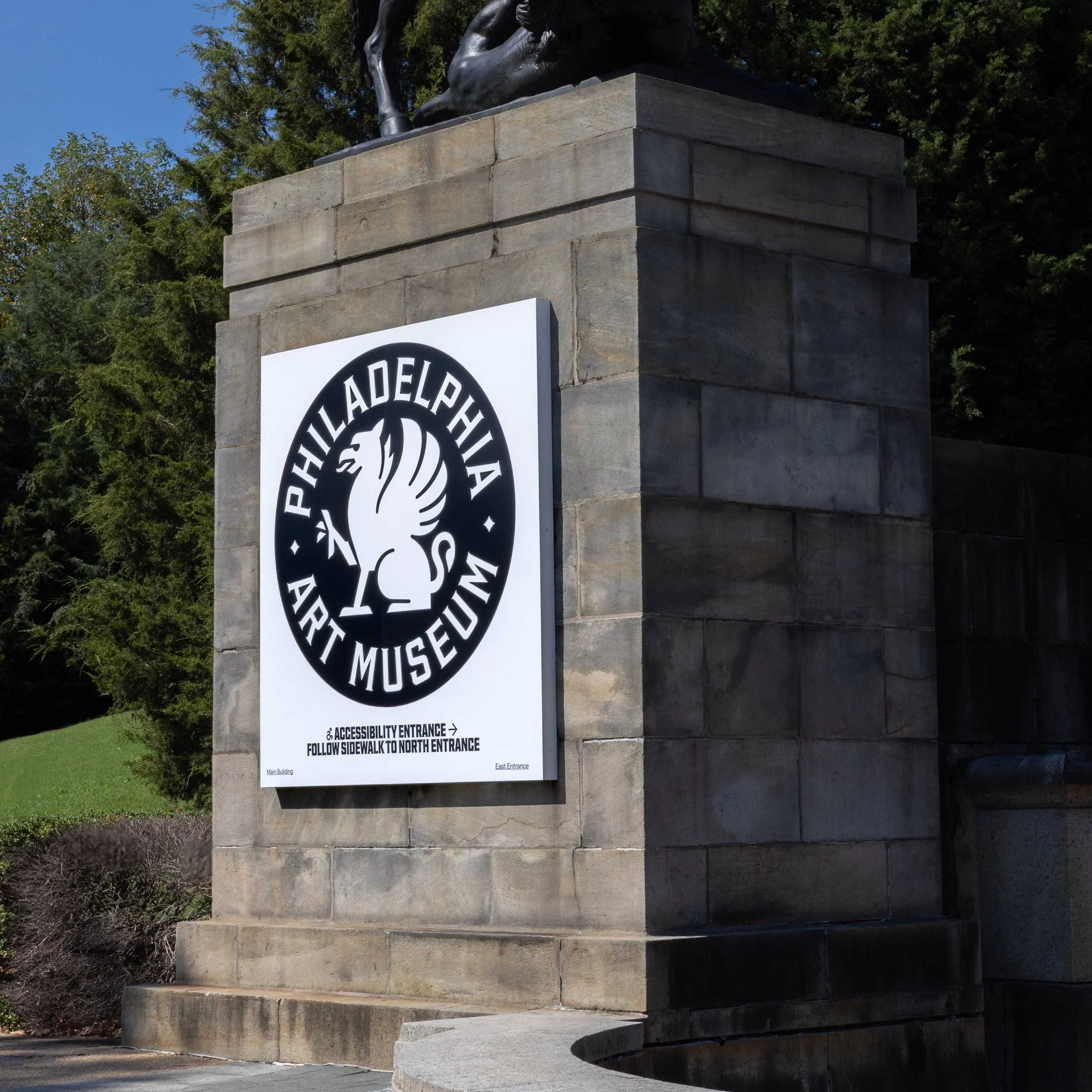
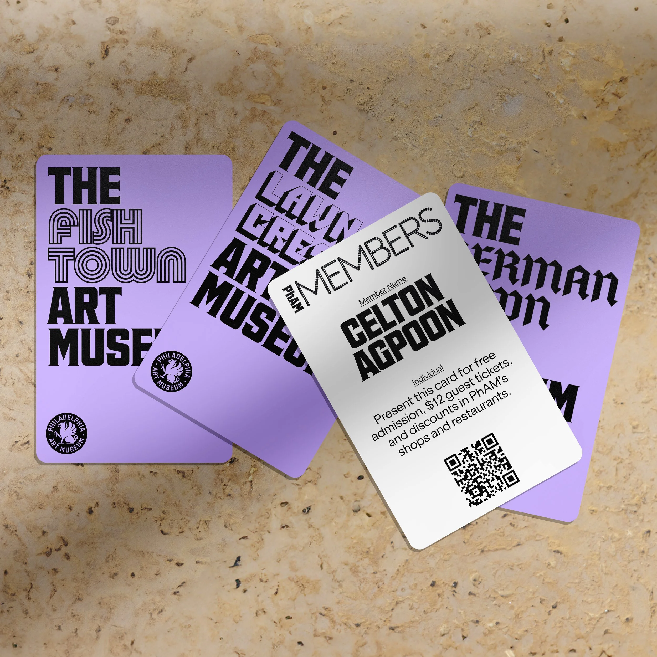
The Philadelphia Art Museum’s primary logo builds on seven decades of brand equity. It features the newly revived griffin—an iconic and mythical protector of the arts. Several different griffins grace the cornices of the museum, and merchandise bearing ‘Griffy’ were consistently among the museum’s most popular pieces.
To mark this moment, the badge was redrawn based on the original 1938 version. Historical details discovered in the museum’s archives and architecture were infused, alongside cues from our custom typography. Through a meticulous process of exploration and refinement, we modernized the badge while preserving its heritage—ensuring it reads clearly from large-scale signage on building facades down to a thumbnail-sized social icon.
The logo system contains a primary badge and a secondary wordmark. These allow us to adapt to different uses and formats while maintaining consistency.
Outside Inside
—
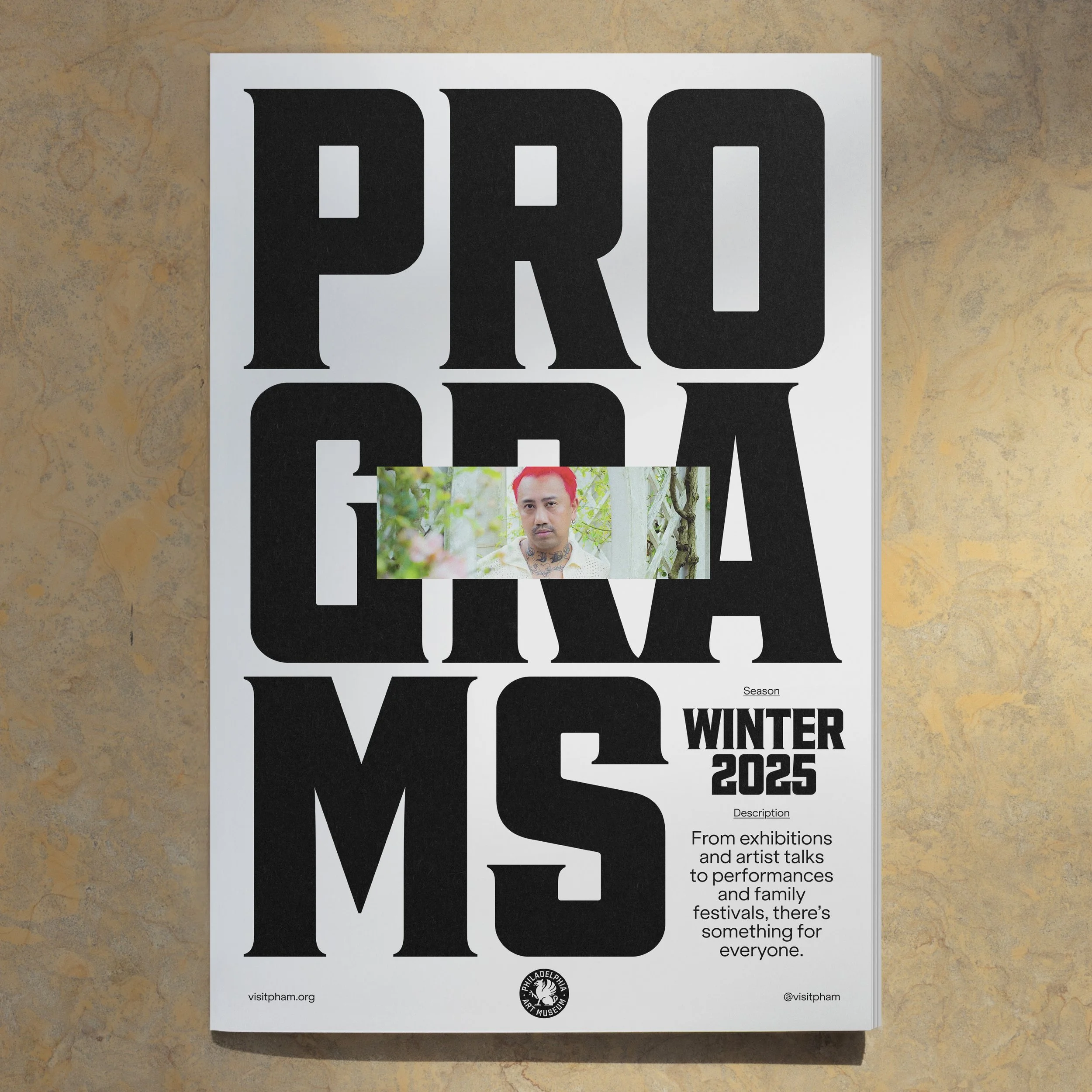
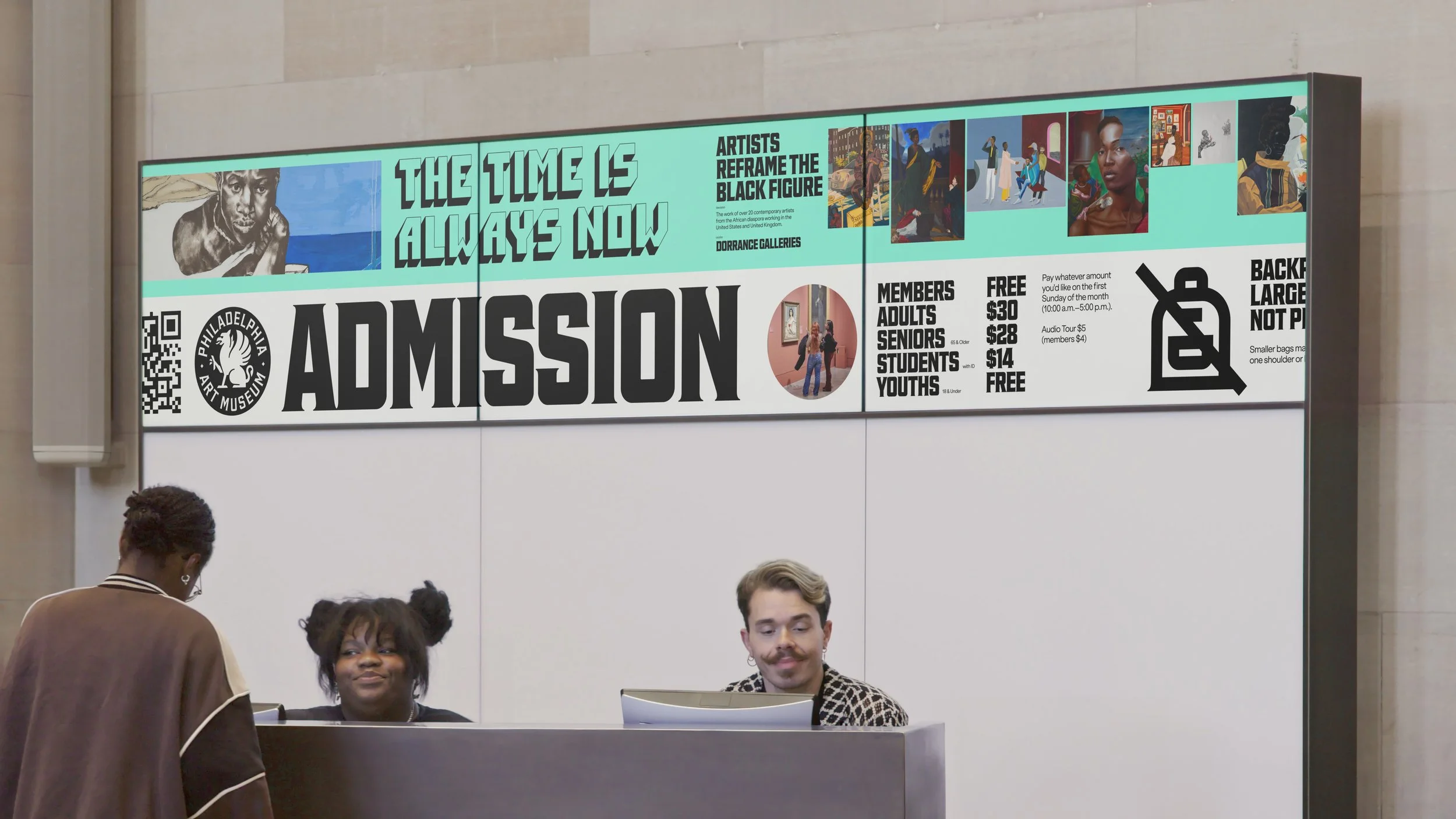
The identity system serves to put the museum in dialogue with the many voices of Philadelphia. Borrowing from the vernacular visual language of storefronts, restaurants, murals, and street vendors gives the brand texture and tension across typography, motion, materiality, color and voice.
The institution is stable, refined and consistent while programming, exhibitions and sub-brands introduce expression and contrast. Quiet and loud. Gritty and witty. Aspirational and accessible.

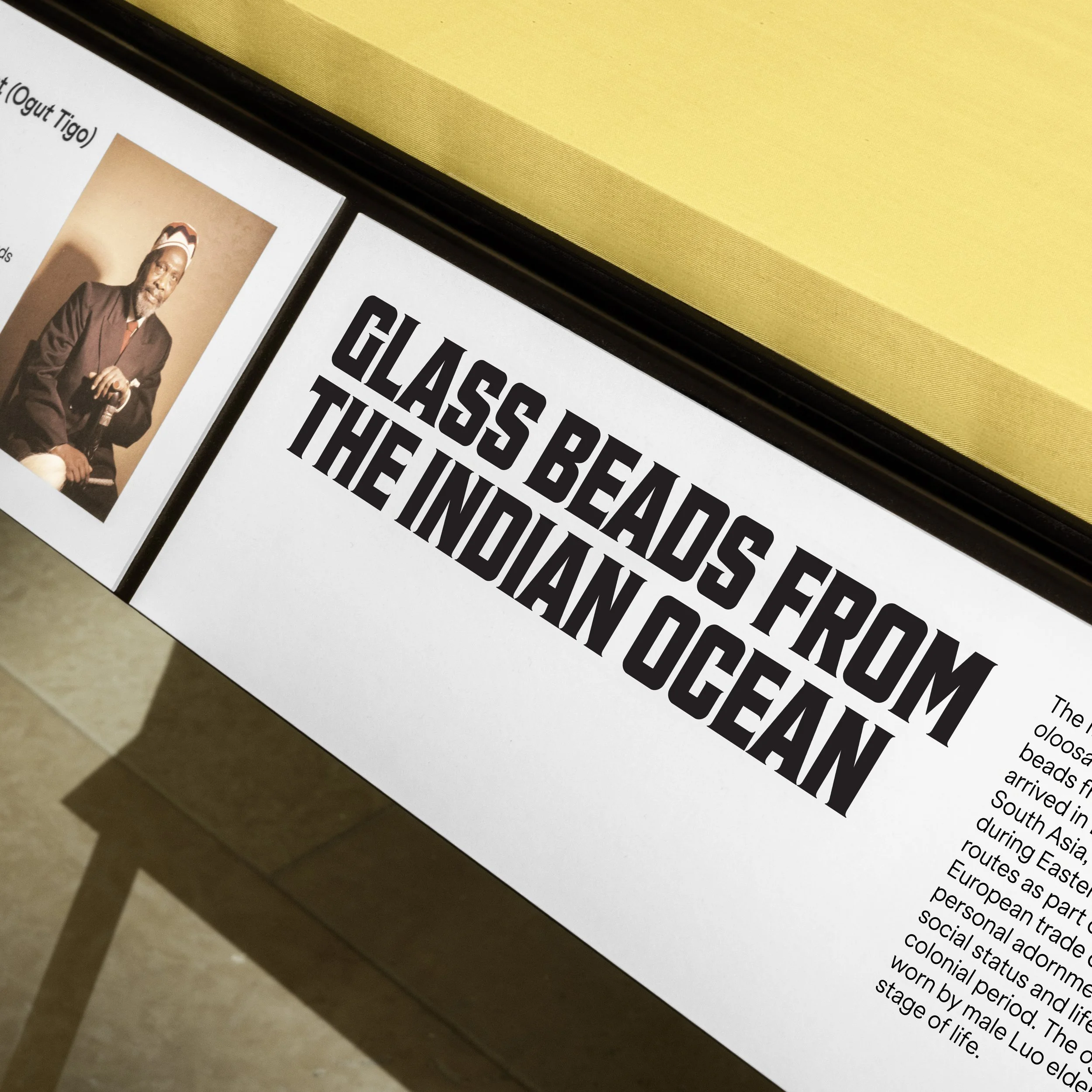
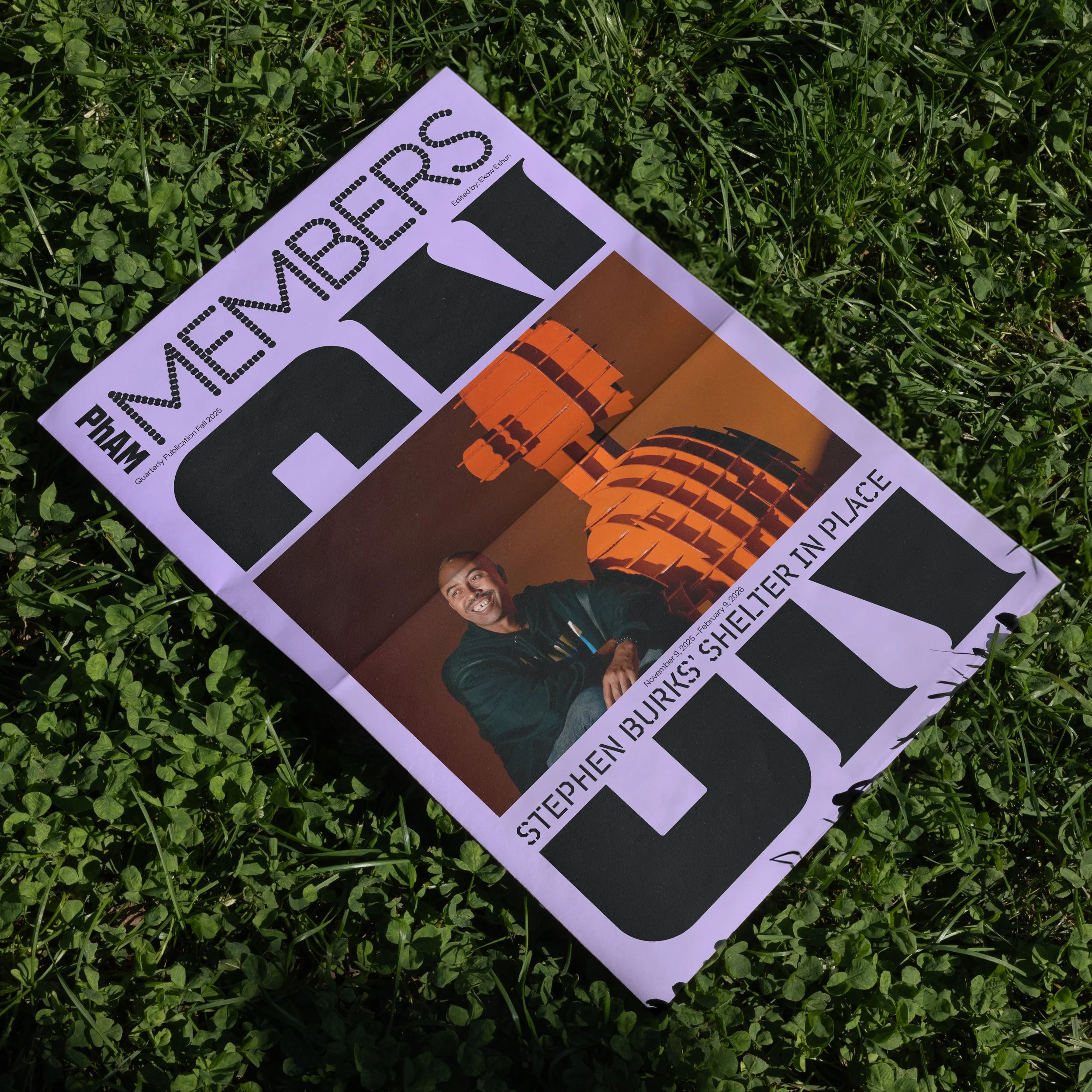
Custom Type
—
Fairmount Serif is the museum’s new custom institutional typeface, which Gretel designed in collaboration with Ryan Bugden. It merges the museum’s origins as the Pennsylvania Museum & School of Industrial Arts and Philadelphia’s working-class heritage with serif details inspired by the museum’s original seal and engraved walls.
We researched classical typography in the museum’s archives and documented the historic lettering found throughout the campus. We also dug into early 20th century American typography with industrial characteristics as part of our search. Along the way, we discovered a specimen of Hess Neobold, an American typeface that combined industrial and classical qualities and was cut by typeface designer and art director Sol Hess (1886-1953). Hess who was born, lived, worked and died in Philly, had studied at the PMSIA for three years and became Frederic Goudy’s successor at Lanston Monotype.
By merging cues from Hess Neobold with signatures from contemporary industrial sans-serifs, Fairmount Serif was born. Sturdy with a touch of refinement, the institution’s typographic voice acts as an anchor and a foil to an extended and expressive typographic palette from exhibitions, programming and sub-brands.


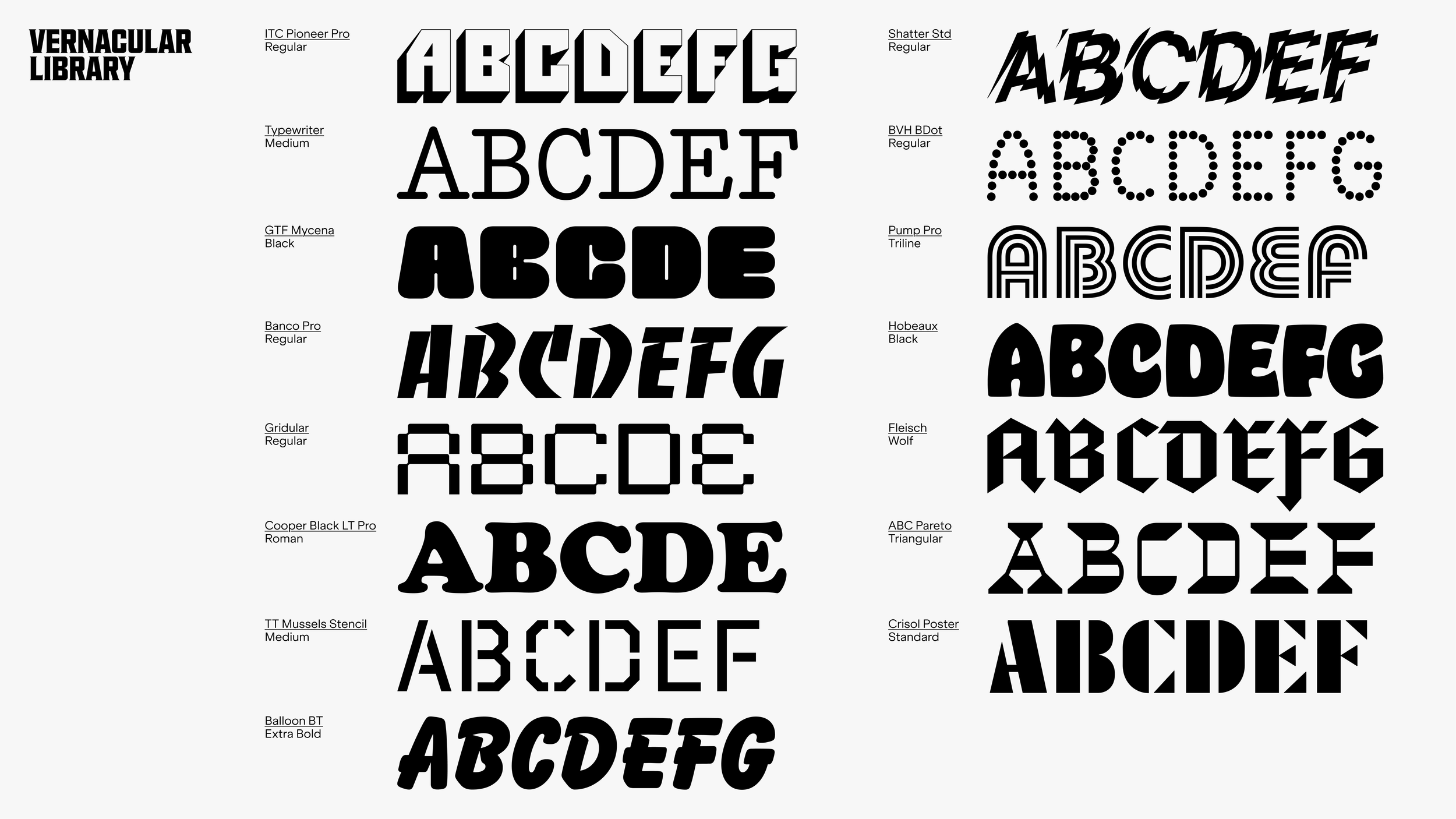
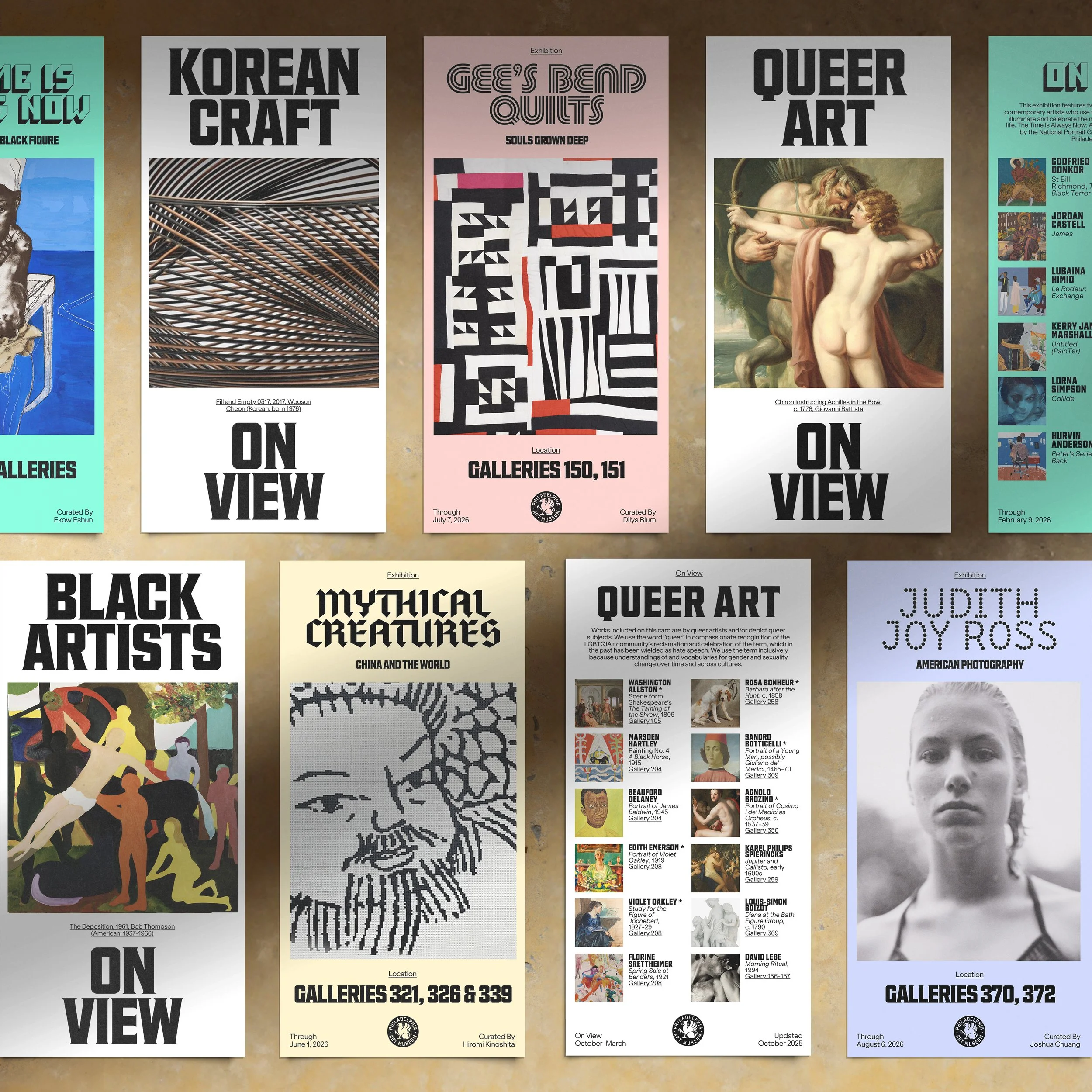
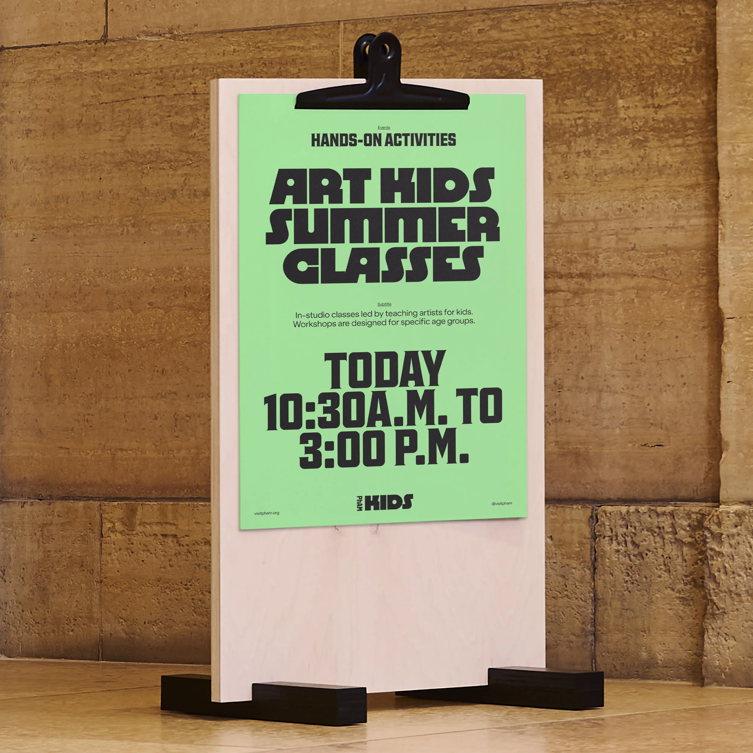
Vernacular Type
—
Typography plays a unique role in the identity. A curated suite of vernacular typefaces inspired by the visual texture of the city give the brand punch and personality. This library is designed to expand over time, and will include additional custom faces commissioned for flagship exhibitions to keep the expression fresh, lively and surprising.
Design System
—
The visual identity adapts across a range of scales and surfaces. From signage and screens, to motion, print, digital and social—it was important to maintain a balance of structure and creative flexibility.
A clear design architecture was established for different ‘orbits’ of brand expression from evergreen institutional use-cases to more ephemeral expressions like temporary exhibitions, programming and live events.


A Digital Overhaul
—
In collaboration with our digital partners Gone Fishing and Philly-based Self Aware, we undertook a comprehensive redesign of the web experience. Relaunched under a new URL at visitpham.org, there was a focus on streamlining key information for visitors, surfacing more of the collection and current attractions, and building a more engaging experience through rich behaviors and interactions.
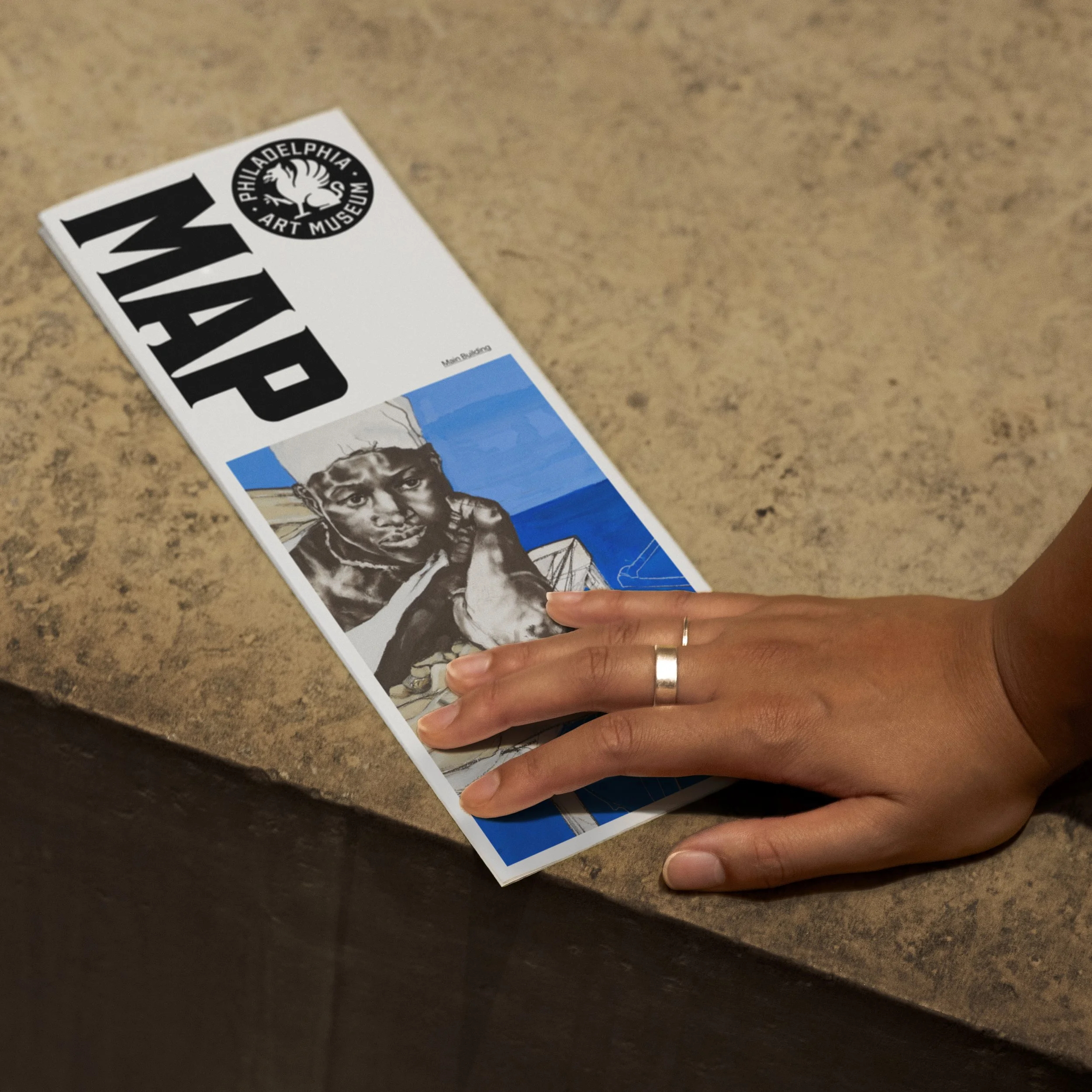
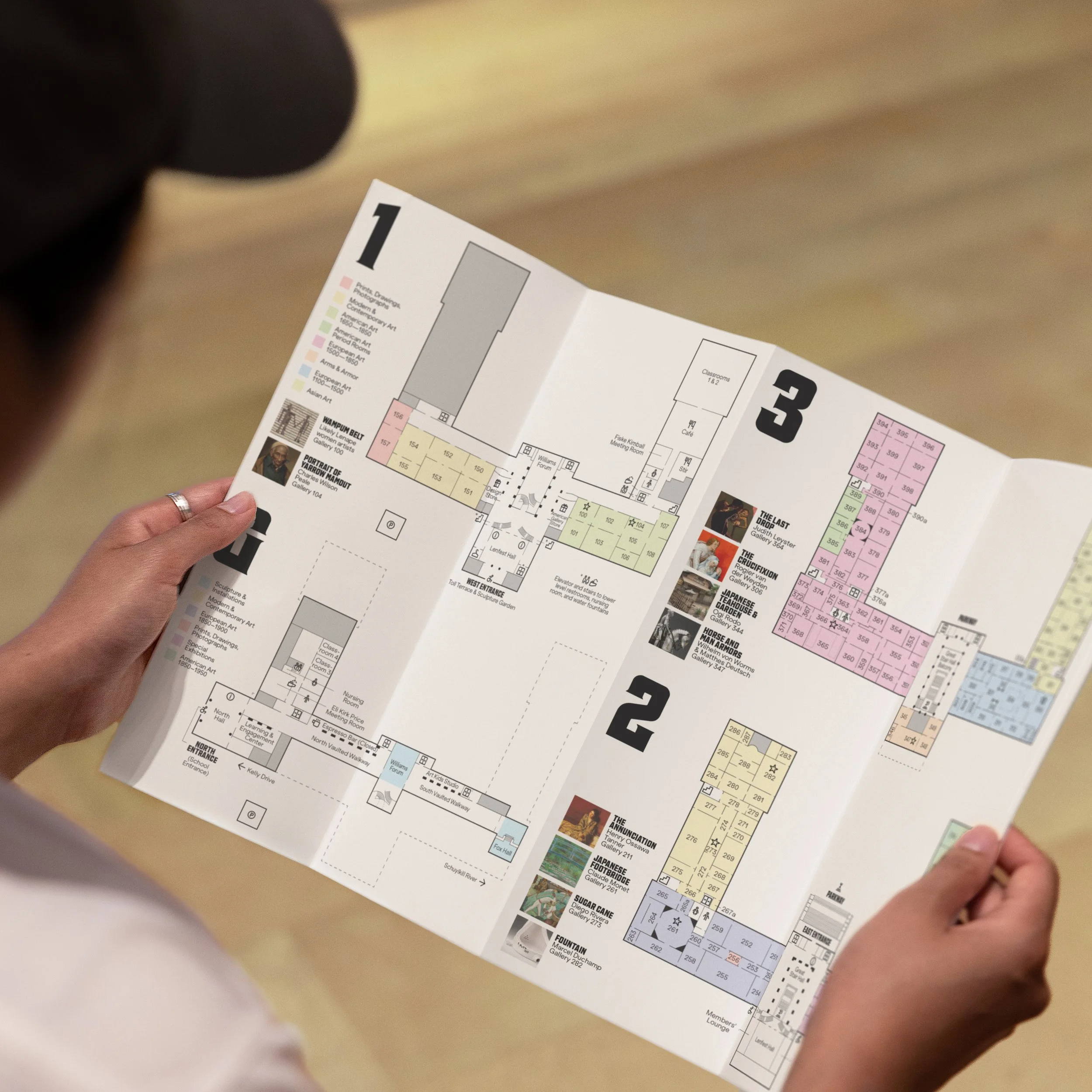
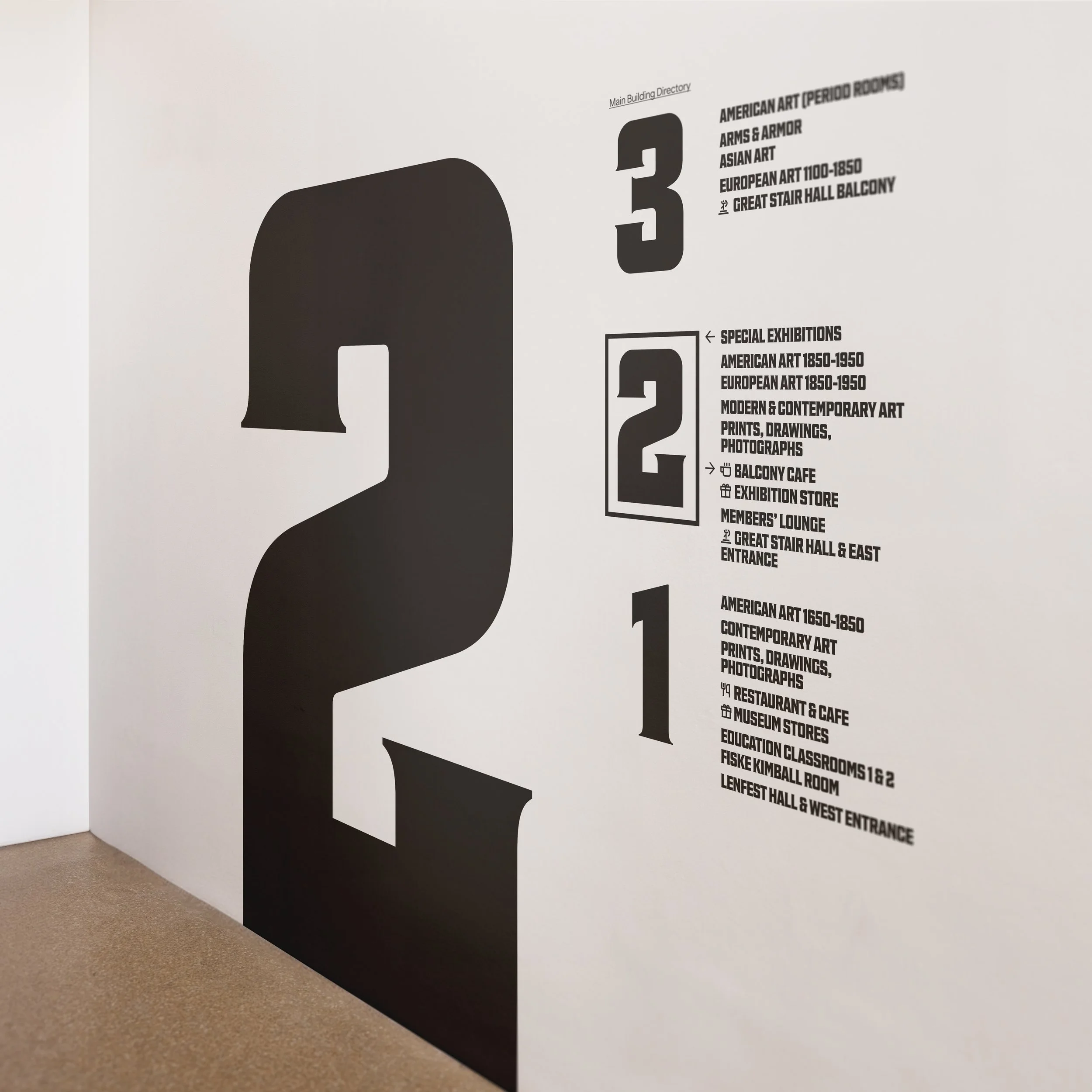
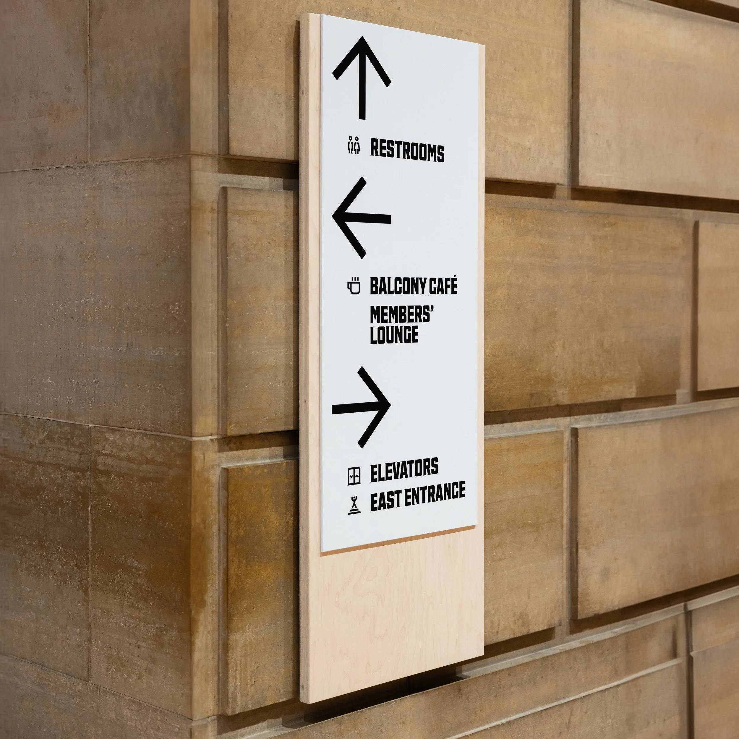
Wayfinding System
—


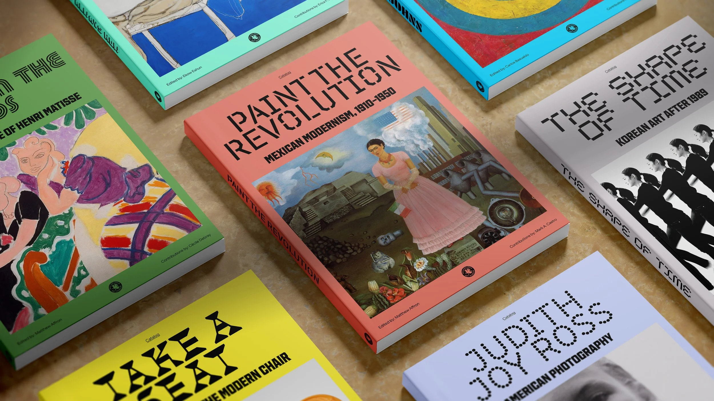
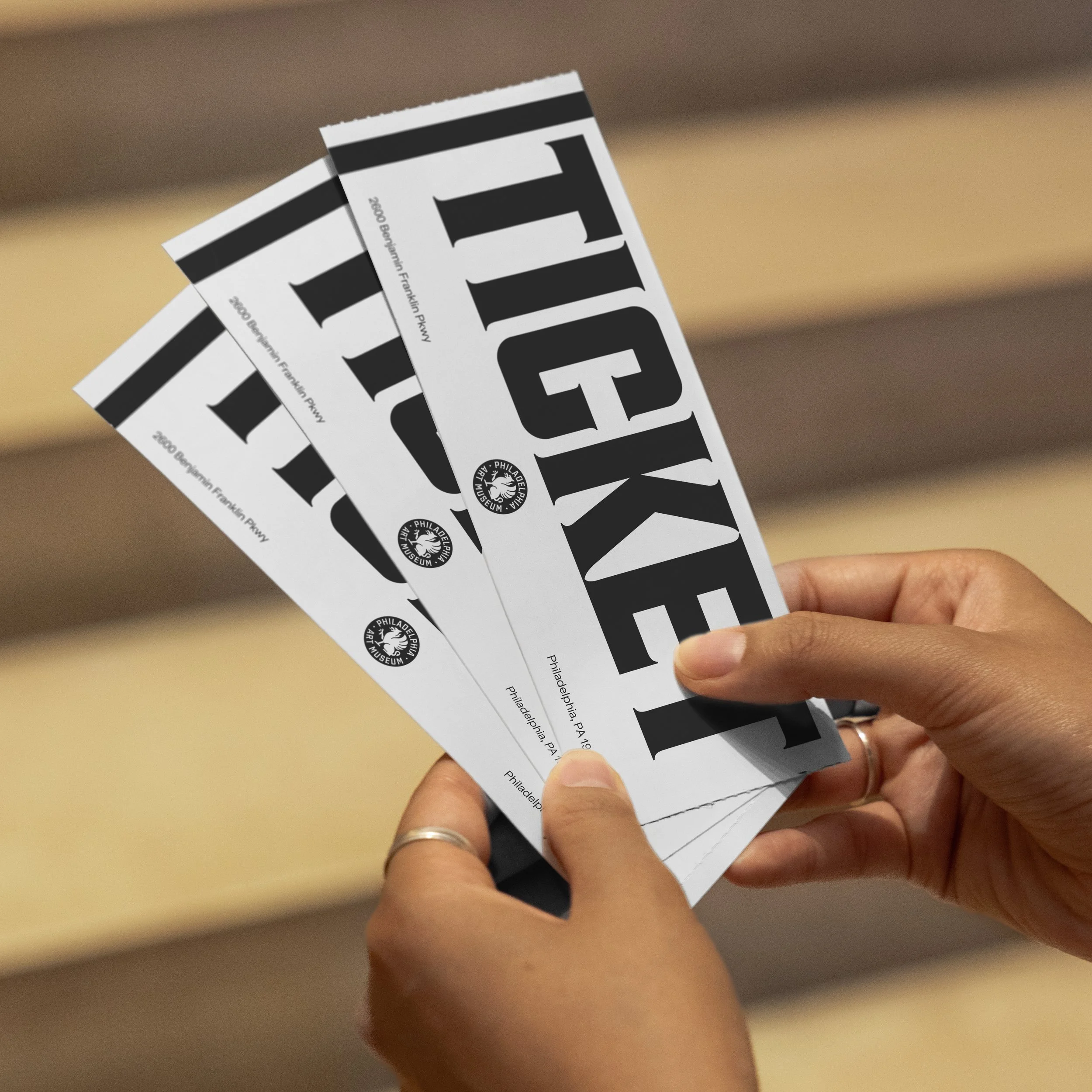
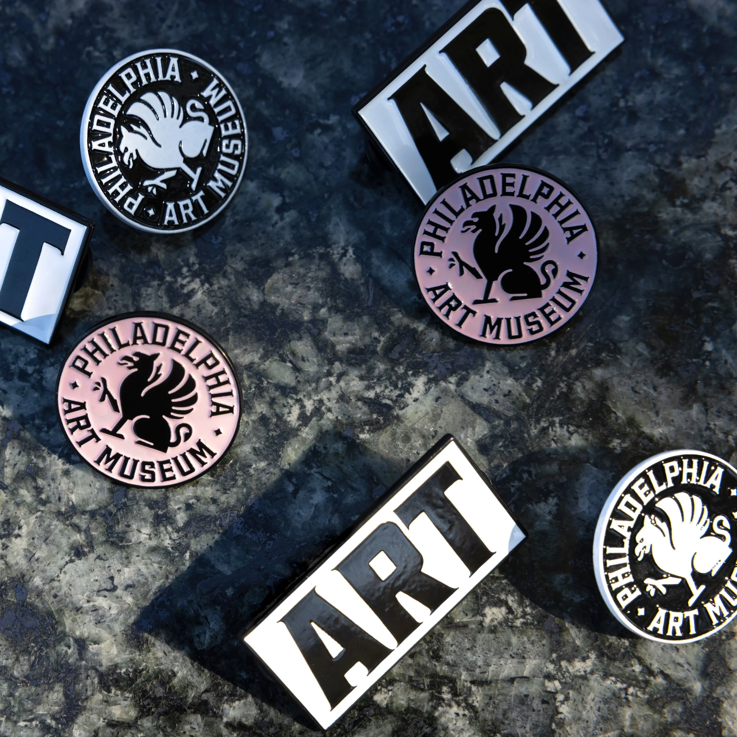
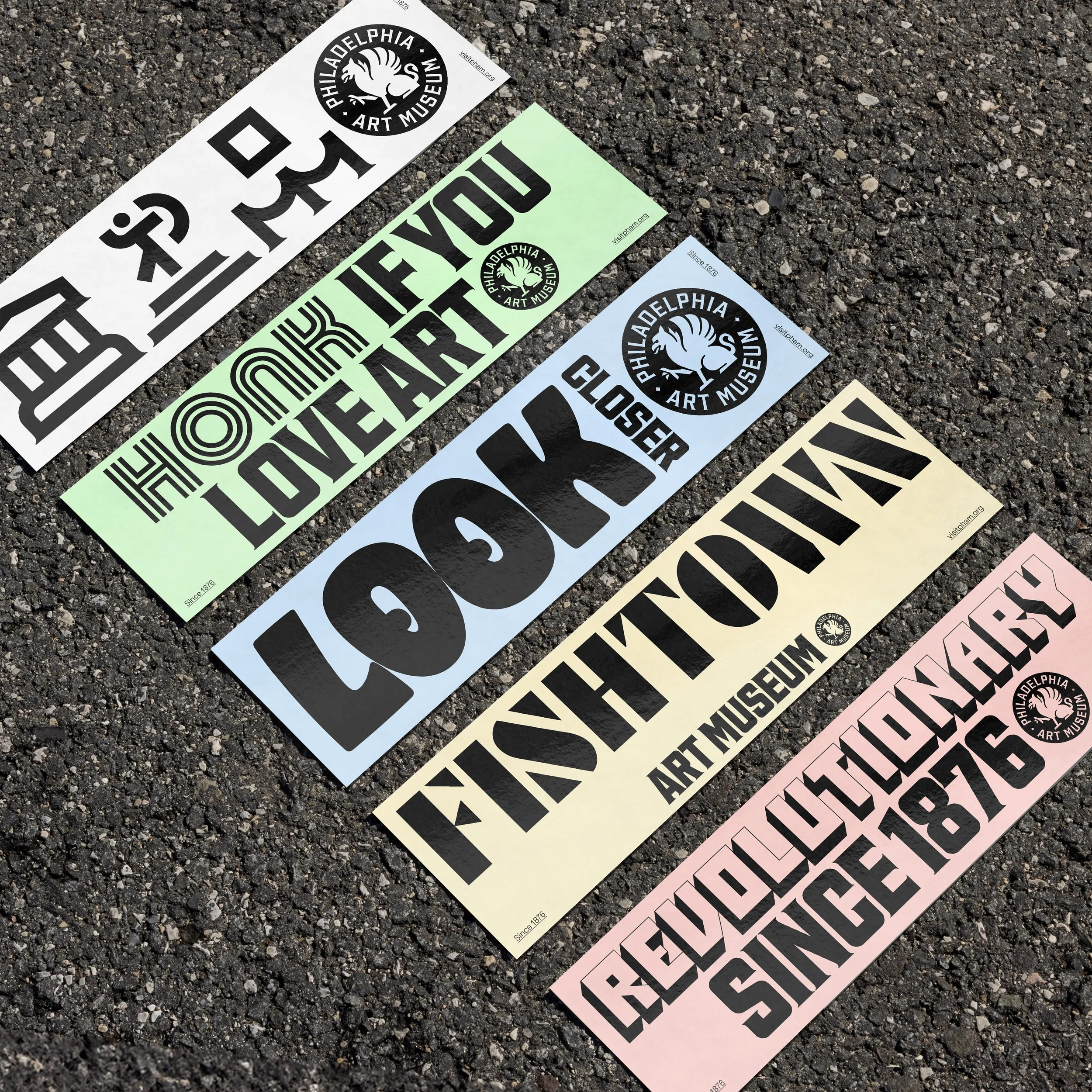
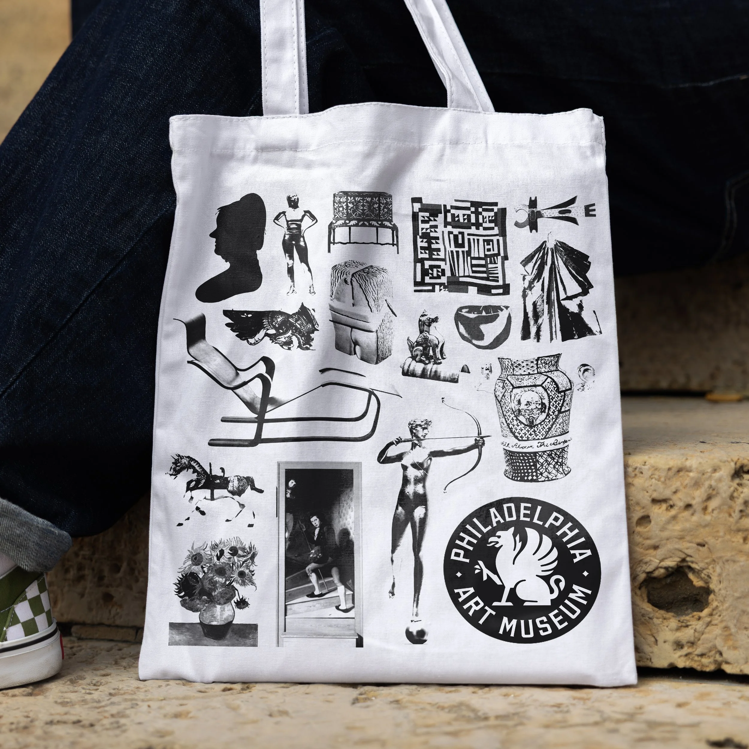
Merchandise
—


Photography: CoCo Hubbeling, Rob Cusick