Noom
Navigating a path to better health
–
Leading the way to a healthier world for all
Noom is on a mission to help people everywhere live healthier lives through behavior change, with a platform grounded in science and psychology. As a high-growth company with users around the globe, Noom recognized that it was time to revamp their original identity and needed a brand that would reflect the credibility, clarity, and distinction they carry as a leader in the crowded health care space.
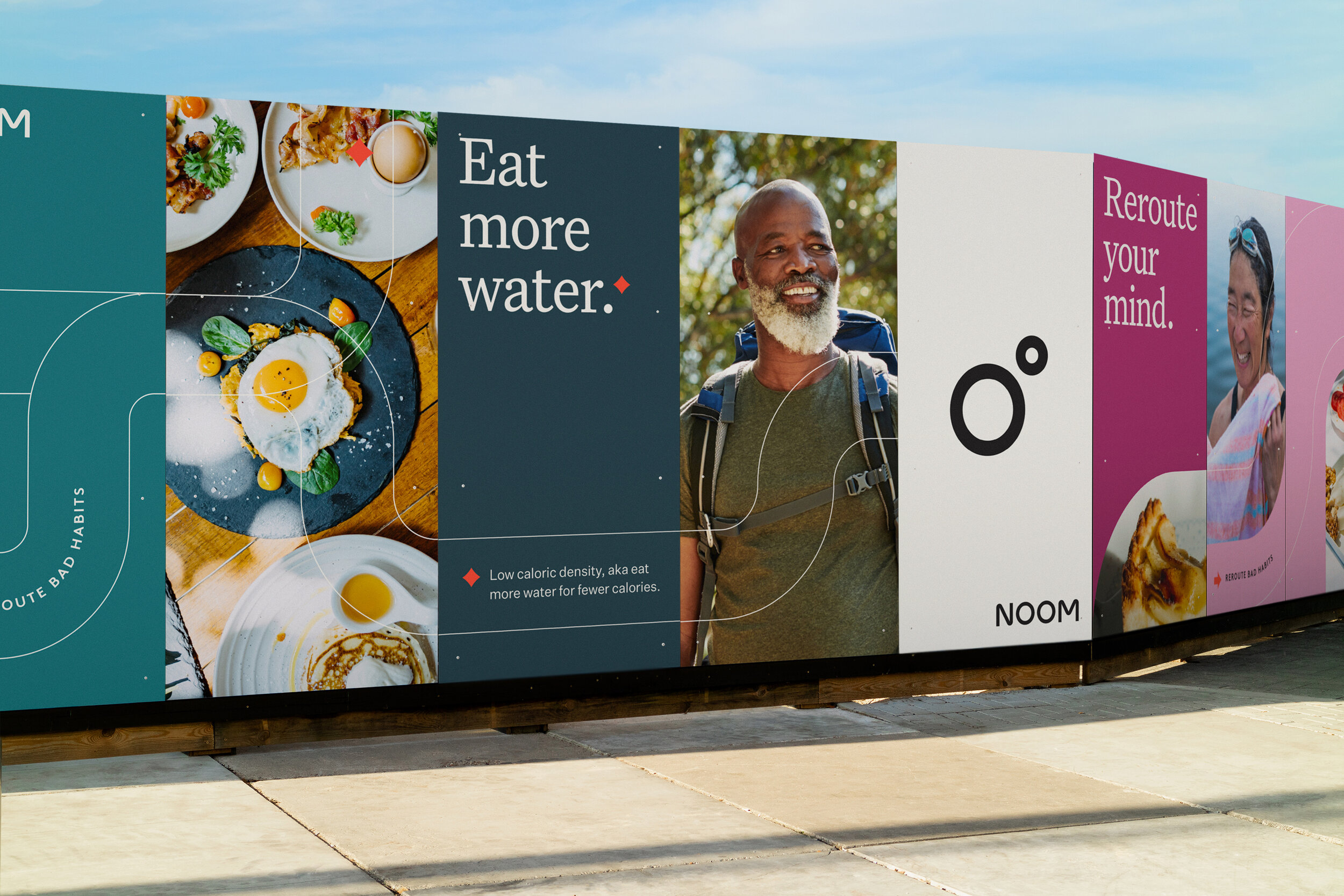
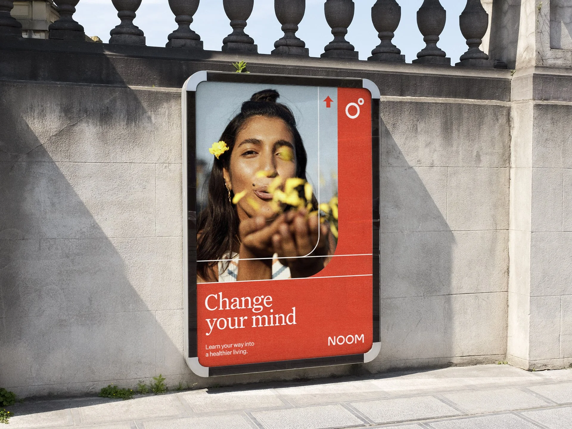
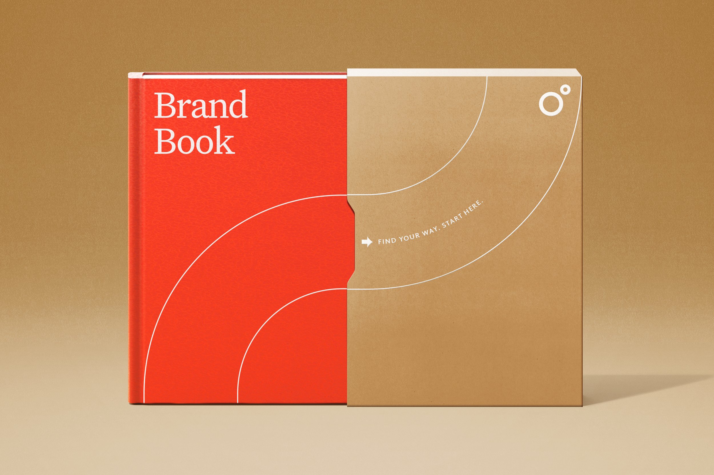
Working closely with the internal brand team at Noom we developed a robust new brand identity anchored around navigating healthier choices. This included a refined voice and distinctive brand signatures that can translate across products and channels.
The Compass
–
As a digital-first, consumer-led brand, Noom needed a clearly identifiable and recognizable symbol in addition to a re-tooled wordmark. The new symbol is a modern, dynamic interpretation of a compass. It integrates seamlessly into a custom-crafted wordmark, making the logo itself a living and responsive brand asset.
Identity
–
A collection of graphic markers and pathways extend the visual language and signature brand behaviors of ‘navigation’. The series of palettes are inspired by the world around us—taking cues from rich shades of delectable fruits and vegetables, to lush landscapes and soothing textures. We devised collage-style illustrations to complement Noom’s psychology-backed curriculum, which come to life within the digital experience.