Netflix
Global rebrand
–
Unifying the world’s leading streaming media service.
Netflix is one of the original innovators of streaming content, and they’ve grown exponentially in the last five years. With an expanding slate of original series, high-profile acquisitions and an exploding user base, Netflix saw an opportunity to implement a cohesive visual system that could grow along with the brand.
The Global Brand Team at Netflix partnered with us to develop this through-line: a conceptual and visual thread to unify every touchpoint. Our collective challenge was to create something broad enough for a global brand but still unique and identifiable. It had to marry the brand with the content. It had to be variable yet systematic and bulletproof. It had to be visually striking, adapt to any format and hold up to interpretation by agencies and vendors around the globe.
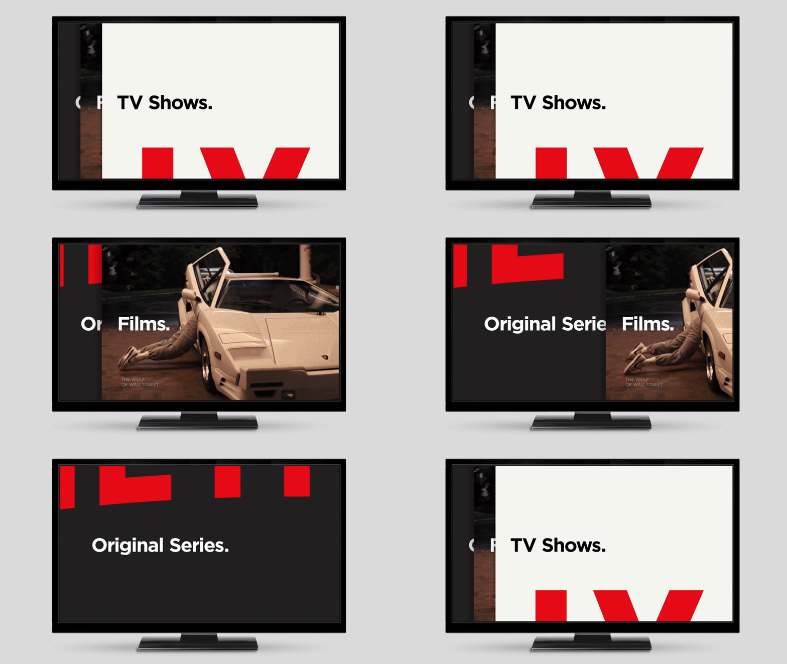
Our solution: The Stack, a visual metaphor and identity system in one. It implies both the infinite, ever-changing catalog and the custom-curated selections that make up the core of the Netflix service.
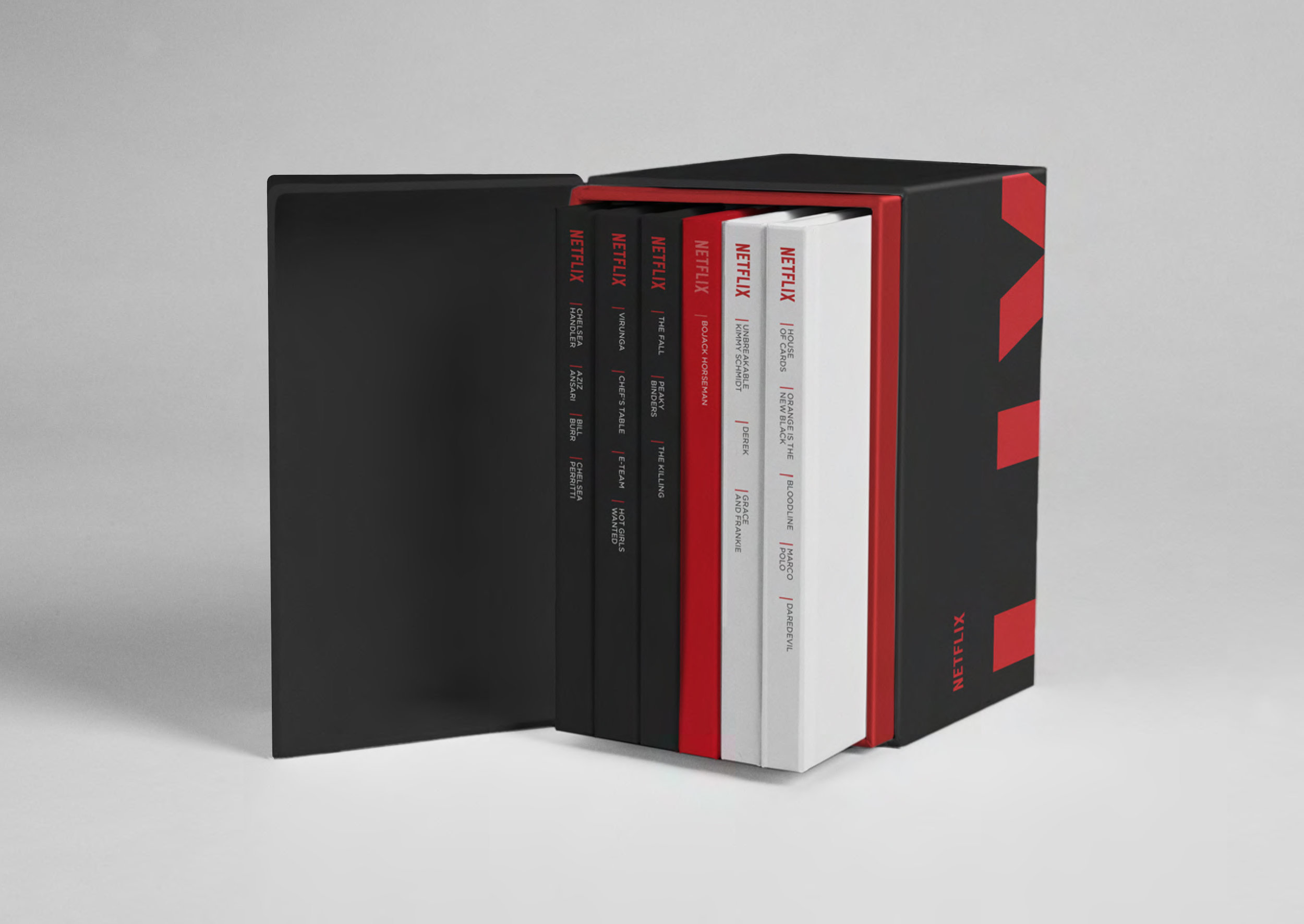
Over the better part of a year we collaborated with the Netflix Global Brand Team to strategize, ideate, refine and implement the Stack. Our partnership yielded visual toolkits, content spots and brand guidelines, and we even launched the company’s first tagline: “See What’s Next.”
The Stack
–
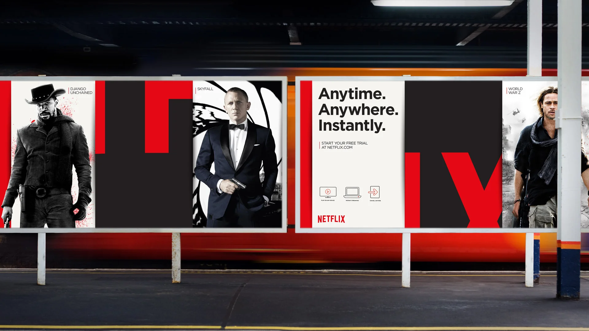
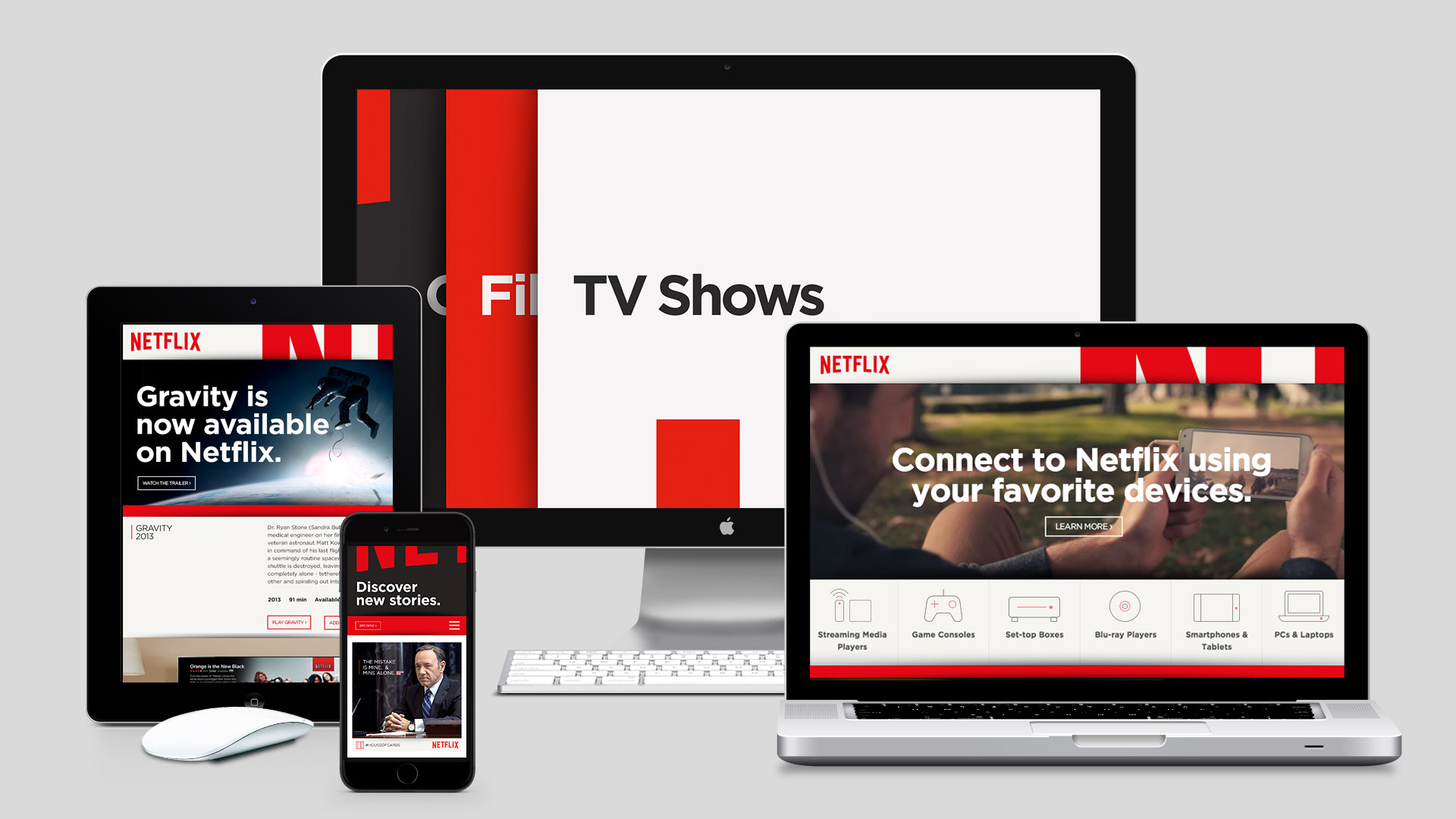
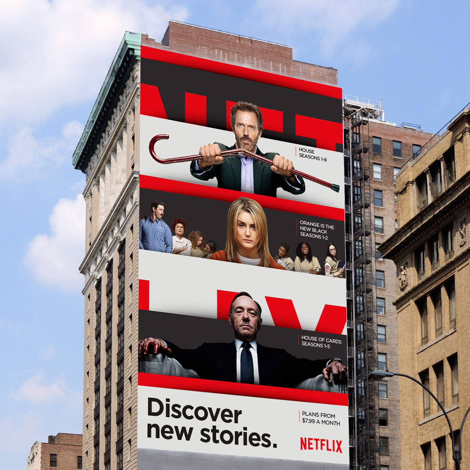
The Stack is an endless, living catalog of shows and movies. It implies two ideas at the heart of the service: selection and curation. Netflix is both catalog and curator, calling forth and constantly updating selections custom-tailored to users. As an identity, it’s distinctive, clear, infinitely variable and easy to use. It can scale to any size and translate to any platform. It works in motion, print, digital and out-of-home. It’s just as effective in Times Square as in Powerpoint.
The Stack is simple – it's built of uniformly sized cards. Cards can contain almost anything. Volume can be dialed up or down as needed. The Stack is endless, whether it's in motion or static, the catalog feels infinite, expansive. Always something more to see.
The Global
Rollout
–
In 2014 Netflix expanded to serve more than 50 countries. The global expansion continues today, with new markets opening up constantly in regions across the globe. More than 65 countries were served by the end of 2015.
In every region, hundreds of ads, posters, banner ads, TV spots, billboards and trailers are produced by a host of different agencies every quarter. Maintaining unity and consistency across all of them meant establishing a clear, flexible system that doesn’t rely on too many rules. Knowing it would be impossible to foresee every possible usage of the Stack in every possible medium, we operated from the camp of guiding principles rather than comprehensive rules and regulations.
A culture of creative freedom and responsibility lies at the very core of the Netflix ethos. Policing the brand globally isn’t logistically viable, and the act itself is counter to that central tenet. With the help of the Global Brand Team, we were able to test the system by trickling out real executions in different regions. Seeing how vendors interpreted our assets helped us fine-tune the toolkits and guidelines in real time.
“Gretel’s new visual identity for Netflix revolves around the ‘stack,’ which is best imagined as a stack of cards all printed with some element of the entertainment company’s brand, like a character from one of its series or part of the red logo.”
“One of the strongest and most comprehensive identities of recent times.”
“A universal branding language that can scale from giant billboards to tiny iPhone apps.”
The Symbol
–
Transcending language and culture, the N represents connection and a never-ending stream of stories to members. Simple and iconic, it instantly sparks brand recognition.
The First
Global
Tagline
–
Developing a new tagline that could resonate both in new and existing markets was a formidable challenge. It had to work if you know and love Netflix or if you’ve never heard of it before. In new markets it needed to pave the way, pique curiosity. In existing markets it had the added challenge of reinforcing Netflix’s current value in the hearts and minds of subscribers.
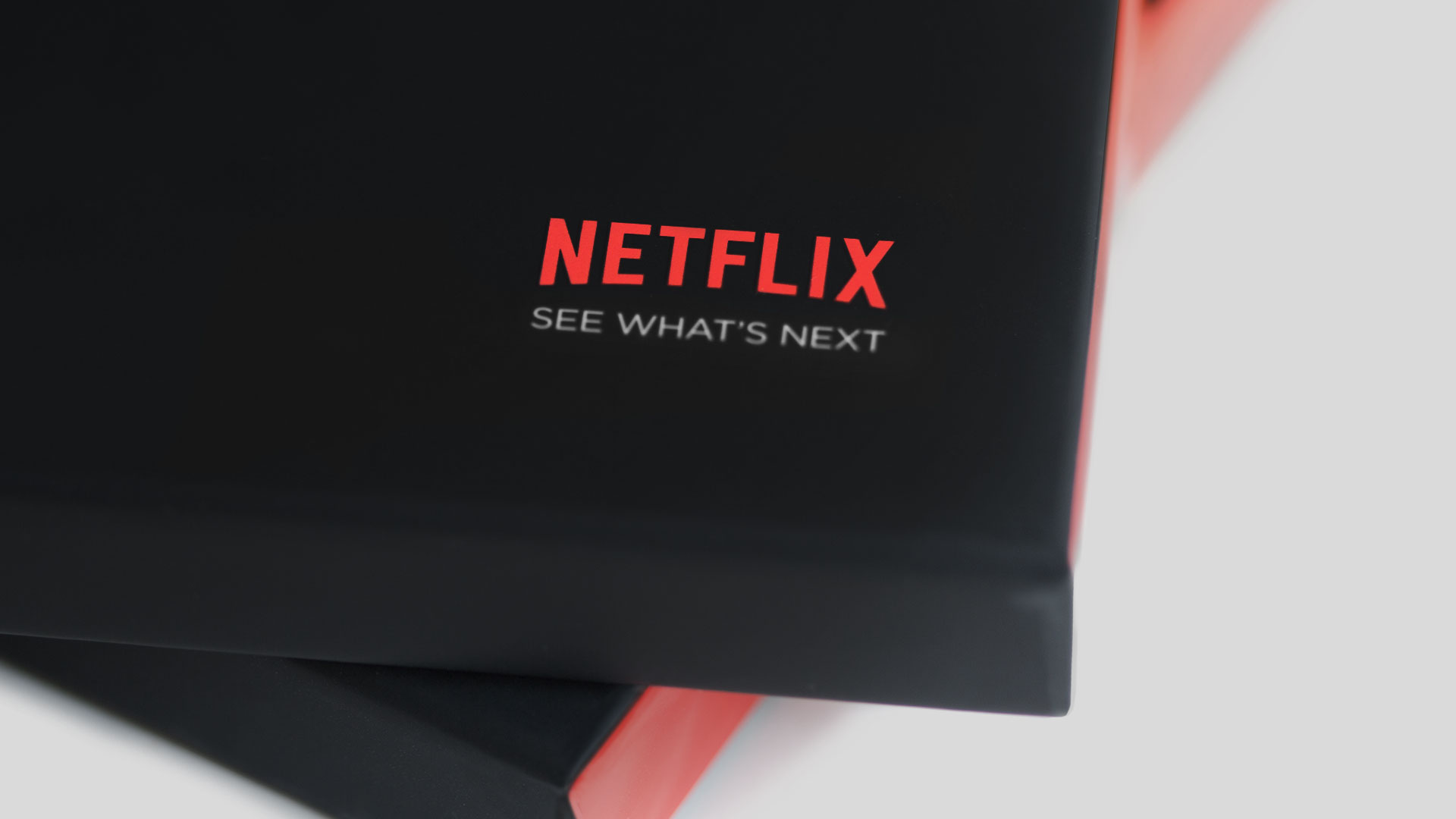
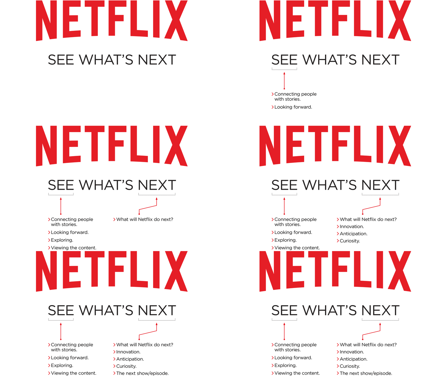
Our answer: “See What’s Next.”
A succinct tag that encapsulates Netflix’s mission and disposition, it also speaks to Netflix’s maverick, pioneering spirit. Connecting people to stories is Netflix's core objective, and anticipation is at the very heart of storytelling. What will happen in the next moment, the next episode, the next season? Where will Netflix take us next? What will the next revolution in storytelling look like?
The Netflix Global Brand Team was both instrumental in shepherding the process internally and launching the tagline externally. It began rolling out to consumers in various markets this summer.
Sounds Like Netflix
–
In addition to the visual system, we worked closely with the Netflix team to sharpen their brand voice. Formalizing a system of language was a natural extension of the brand guidelines. The voice guide we created gives both top-line guidance and tactical examples pulled from real-world executions.
As the brand evolves, the Netflix team continues to update the guide with examples of the conversational, familiar language that express the Netflix brand voice.
Building a Brand Hub
–
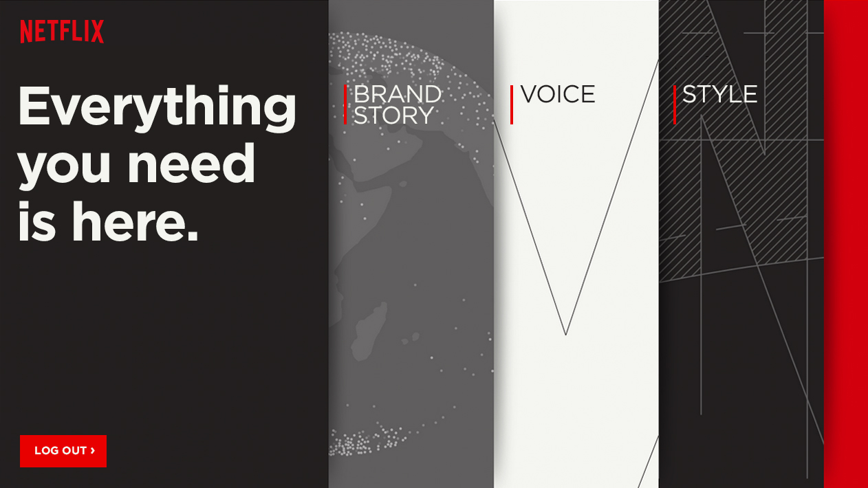
The brand guide gives partners all over the world a central hub for voice and style guidelines, examples and digital assets. It’s comprehensive but succinct. The focus is on showing examples rather than running down the rules. Users can get a quick view at a glance or drill deeper for specifics.
Netflix is a living brand, constantly evolving. So are the guidelines. The brand team regularly curates a selection of the best work across different platforms and feeds those dynamically into the brand guide. Partners see their best work reflected back at them and the brand stays relevant and current.


