LOVB
League One Volleyball
–
Launching the next major
American sports league
League One Volleyball (LOVB, pronounced “love”) is a first-of-its-kind community re-imagining the future of volleyball. They launched their professional league from the grassroots up - each pro team built from a foundation of ambitious junior volleyball clubs located across the country.
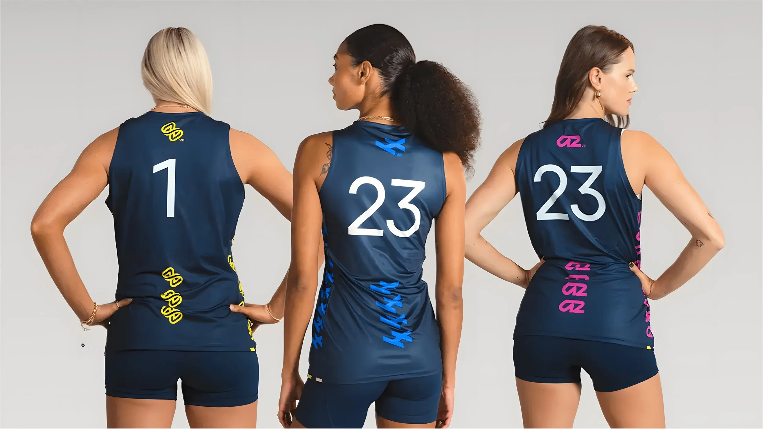
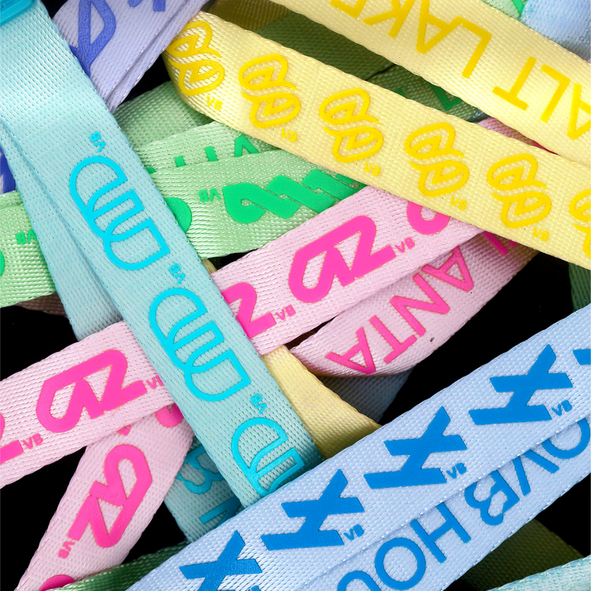
Our team design is decisively modern, forward-facing, and unique to LOVB. Team logos are unique marks built from two or three interconnected letterforms that are recognizable but not necessarily 'readable'. Each logo adds a new variation that complements the family. Team design systems reflect each community through connected patterns rooted in each team logo and a color palette inspired by each team's spirit. This design strategy creates coherence among a (growing) family of team brands.
One League Interwoven
—
LOVB Pro stands apart from traditional sports leagues by placing community and connection above all else. Each player, team, coach, club, city, and fan forms an essential strand in an interconnected mesh. Together, they create something stronger, more flexible, more resilient, and more dynamic than any single part could achieve alone.
This vision inspired our creative platform, Interwoven. Our strategy and design language center on collectivity, binding together the league and its players. This tightly knit community is designed to grow as new markets and new teams are created, reinforcing and strengthening the whole ecosystem.
Unique but United
—
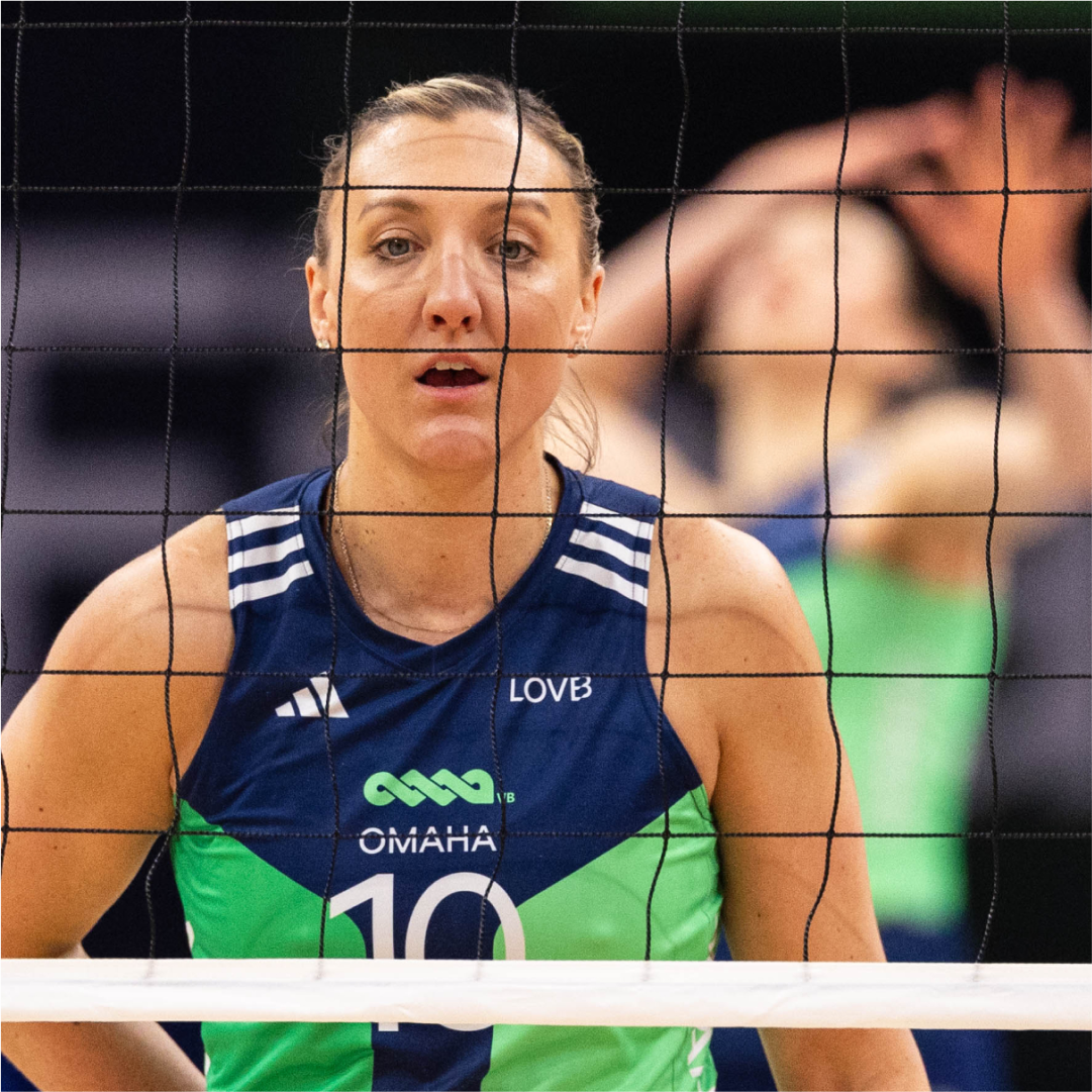
LOVB Pro's inaugural season features six teams from six cities. At the launch of the brand, only 5 cities had been announced. We worked with the LOVB team to define a naming construct, brand essence and shared design language for each of the 5 initial teams.
As we explored early concepts for team branding, we purposely avoided traditional sporting tropes of landmarks, mascots and civic heritage. We looked instead for a spirit, or essence of each city that could inform a simple, typographic abbreviation. Hustle embodies Atlanta's drive, Pulse for the crackling energy of Houston, Flow mirrors Madison's free-thinking spirit, Progress defines Omaha's ambition, and Ascend reflects Salt Lake's optimism and altitude. Taking our own brief, we explored a range of options for each team monogram.


Tightly Knit but Built to Grow
The league's design framework serves dual purposes: celebrating each city's unique energy while establishing a scalable system and cohesive guidelines for future expansion. Each team's emblem features fluid, continuous lines that echo LOVB’s interwoven ethos. These emblems can be expanded into distinctive interlocking patterns, and can be brought to life in motion, on-court, in-arena, on team kits and fan merchandise.
The LOVB team worked with F37® Studio to refine the mark for Houston (HTX), and LOVB developed the 6th inaugural team, Austin (ATX) identity without Gretel– both perfect test cases for our guidelines. More teams will follow in the coming seasons.


Photography: LOVB, Adidas, Gretel
Site Design: Artifact
3D Animation: Colors and The Kids