Knoll

Say hello
to HiLo
–
A seat that keeps you
on your feet.
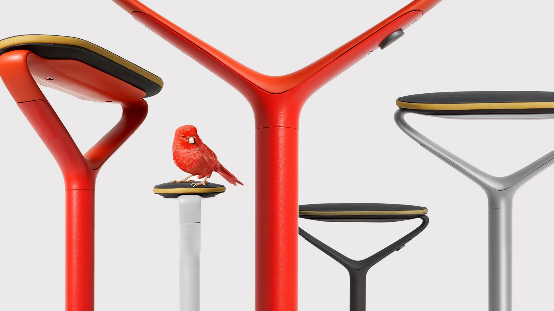
The brand identity for Knoll’s new product, the HiLo. It’s a category-breaker with unparalleled form, designed for standing desks and impromptu meetings.
To capture the HiLo’s two main traits – its lightness and mobility, and the unique way the user engages with it – we used the metaphor of a tiny bird alighting on the seat. This simple image evokes curiosity and begs the viewer to follow our bird through all of the literature associated with the product – from brochure, to microsite, to in-store merchandising.


The scope of the project also includes the in-store packaging for the HiLo. This is a first for Knoll, as they typically don’t package products for retail sale. The designs must attract and educate, yet retain the playfulness and simplicity of the overall brand thinking.
“There’s been this battle that’s been going on for a long time between is it better to stand or is it better to sit? This is the answer to that.”
DESIGNBOOM | JUNE 2016
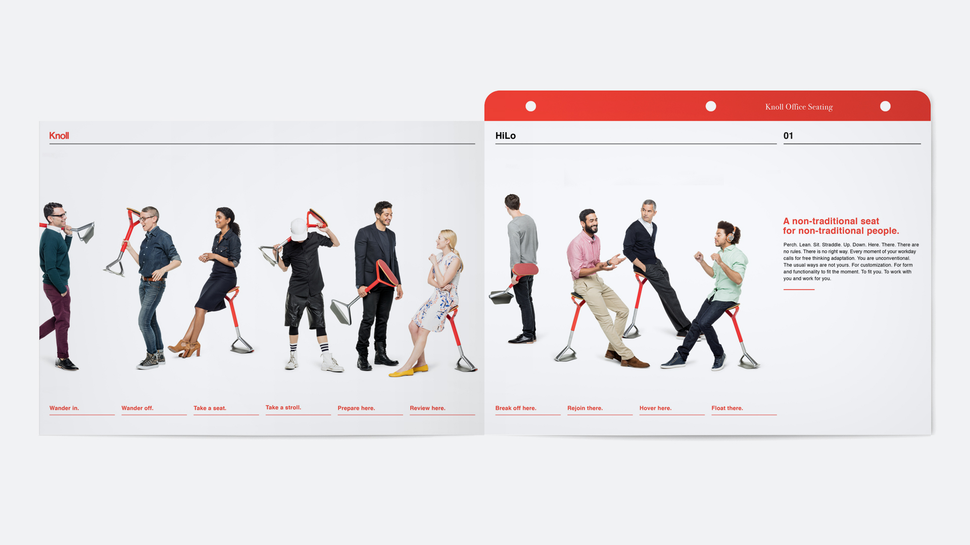

Merchandising Concept


Staying true to the Knoll typographic purity, simple pairings quickly evoke the spirit of the brand and the people who engage with it. Opposing ideas are combined into one powerful expression.
The HiLo is a big reveal for Knoll and warranted its own microsite to build interest and to educate. The site captured a variety of images of the product in use (including a tutorial video), production sketches and designer profiles.