IFC
Graphic Language
–
Doubling down on brand voice as visual identity
Our first re-rebrand
–
We originally rebranded IFC in 2015 to mark the turn from independent film to indie comedy. The identity was built around the idea of IFC as a venue, the kind of place that’d host improv comedy and cult movies back-to-back. This gave us a host of design cues and brand behaviors like billing talent, promoting the acts, and most importantly—amplifying IFC’s editorial and curatorial voice.
All in on Slightly Off
–
As IFC had expanded and evolved their programming slate, they felt a need to open up the range of expression within the identity system as well. The previous iteration was restrictive by design, meant to stamp a disparate range of content with a heavy dose of IFC.
The new identity still had to be flexible enough to work across a range of original comedies alongside a rolling catalog of movies. Just as important– it had to be nimble, lightweight enough to respond to content and culture in real time.
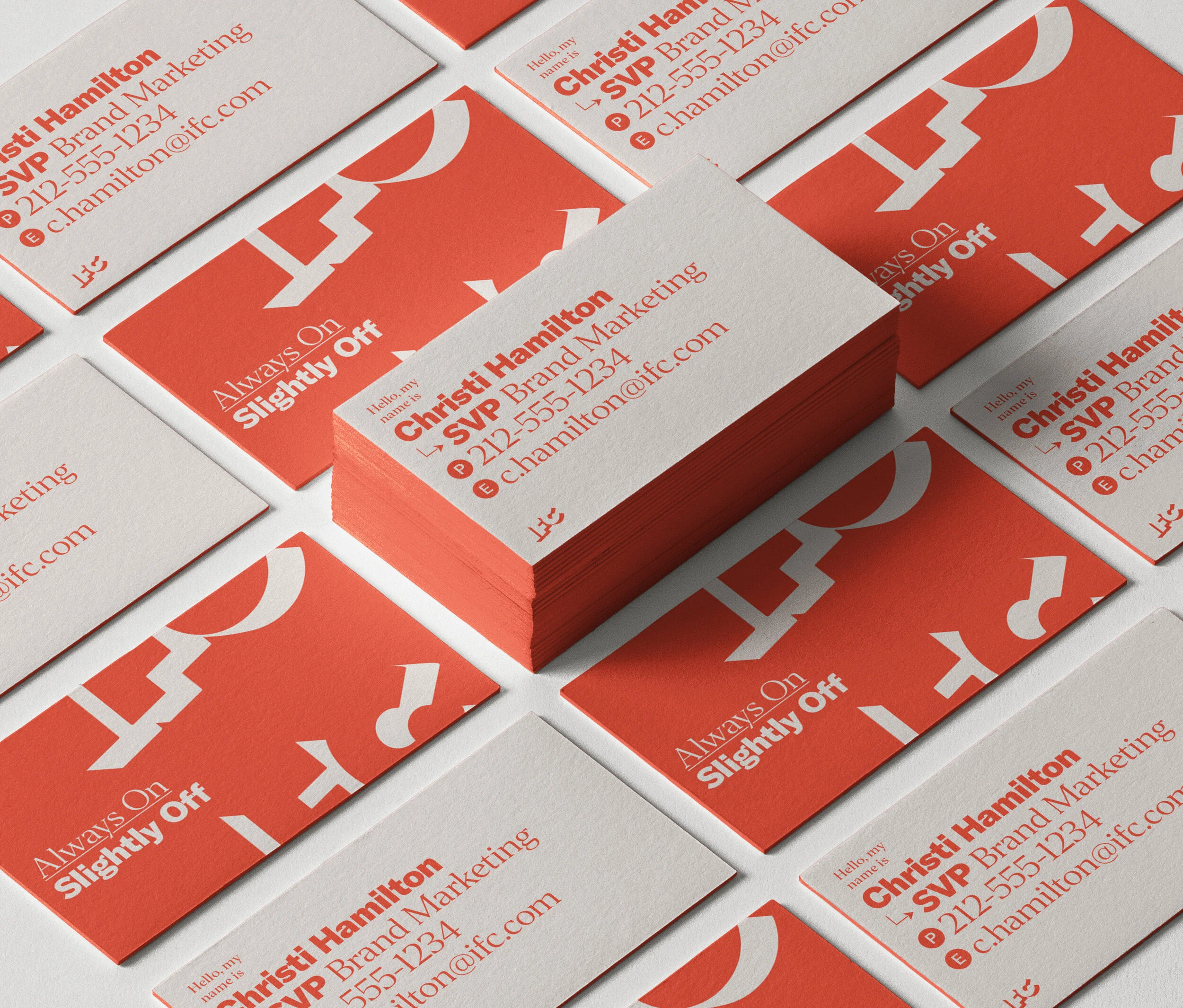
Our solution was to strip down the brand to the core: the Slightly Off voice. This was something no competitor could copy, and we put it front and center. In fact, the graphic identity is entirely typographic.
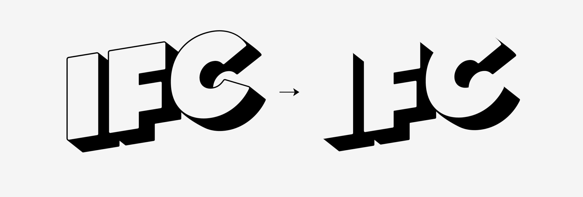
Logo Update
We were finally able to lose the keyline and present the mark as originally intended.
Voice
Content. Culture. Conversation.
To capture IFC’s enthusiasm for and expertise in comedy and movies, the system is inspired by modern fan culture. We’re implying the conversations around content that can unfold everywhere from 4chan to fanzines, social media to Subreddits. Our voice can hyper-link content and characters together ala Wikipedia or IMdb but the design and motion behavior remains decidedly analog, anachronistic even.
Glyphs
TDC: Citation for Typographic Excellence
TYPE DIRECTORS CLUB | 2019


