IFC
Top billing
-
A new language for an indie darling.
IFC is a comedy network with sharp original series like Portlandia and Comedy Bang! Bang!, as well as an expansive library of movies. They occupy a unique niche in the comedy spectrum and draw a loyal audience of followers on- and off-air. Part of the impetus for the rebrand was to make a clear break from the brand’s legacy as the Independent Film Channel and raise some awareness about their new, expanded slate.
Within IFC, each team knew their brand, even if it was on an intangible, emotional, instinctual level. There was a clear sense in every department of what felt like IFC and what didn’t. Our challenge was codifying that nebulous IFC-ness into brand tenets, guidelines and language.
Thinking of IFC as a venue became a through-line: billing talent, promoting the acts, curating the movie selection and being careful never to steal the spotlight from the headliners. This core idea informed all aspects of the design, from the logo to the endpage layouts, even the typography. Honing the “Slightly Off” brand voice led to re-thinking the use of language on the network as a whole, from title cards to promo structures.
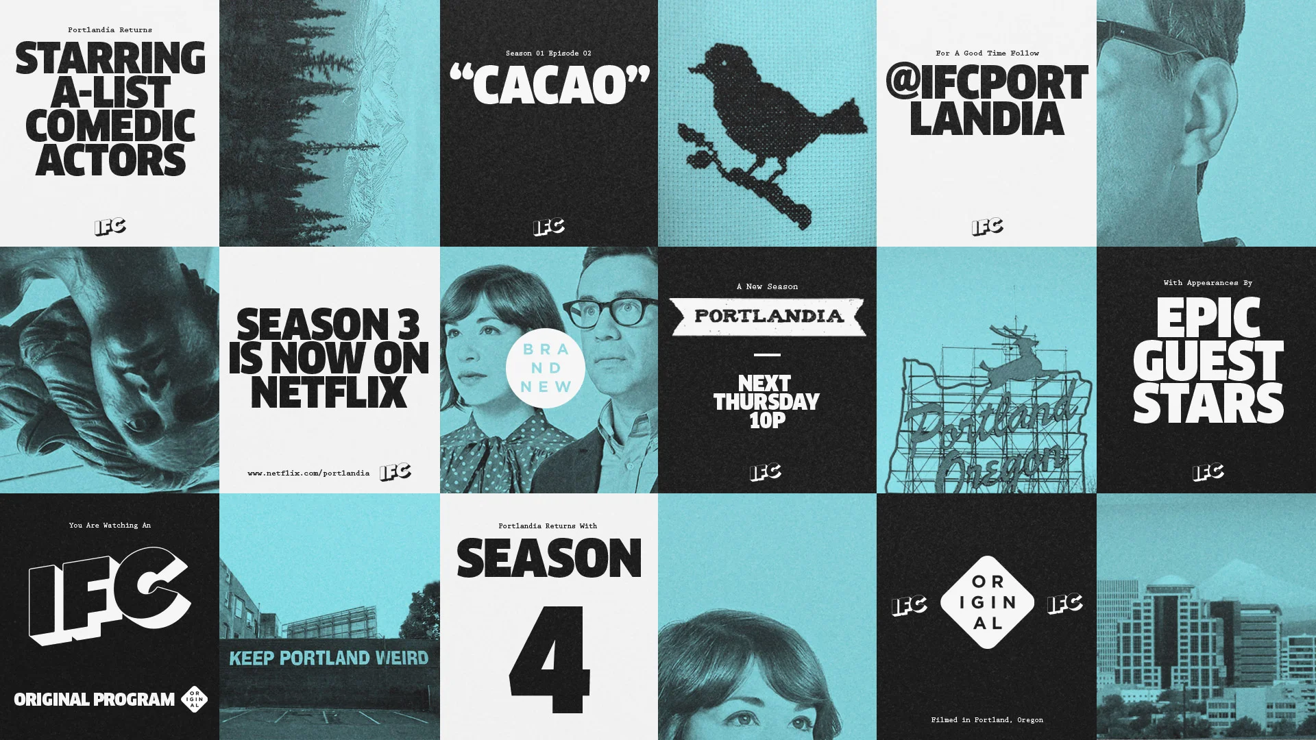
A stamp system for organizing and branding content, insider language, top 5 lists, meme-like IDs; slicing our content through different filters keeps our promotion sticky, unconventional, slightly off. A crisp, clear graphic language lets the voice shine through. Hundreds of movies, six original comedies, three colors, two typefaces and one singing couch: IFC.
Hundreds of movies,
6 original comedies,
3 colors, 2 typefaces,
and one singing couch.
D&AD Awards:
Graphite Pencil
IFC Rebrand Case Study and Interview with Gretel Creative Director, Ryan Moore.
Sharpening the “Slightly Off” IFC voice was our first challenge. Specifically, imbuing the brand with a personality that didn’t compete with the content. Eventually we boiled it down to three key tenets: We’re Direct, We’re Big Fans and We’re Connected.
One big takeaway from our brand audit was the traction that the digital and social teams were pulling. The IFC Blog, Facebook pages and Twitter feeds were a hit with fans. The way content was parceled out in bite-sized chunks – lists, memes, quotes – it all felt fresh. It informed everything from the new voice to how we structured promos and IDs.
“IFC’s bold new branding proves Tumblr matters as much as TV.”
Type Directors Club:
Winner
“Slightly Off” means we always look for the unexpected take. We speak plainly and call out things that don’t necessarily need calling out. We’re constantly listing, sorting, naming, quoting. We know TV isn’t just on TV anymore. We make promos out of Tweets, point viewers to Netflix and tip them off to comedians they might like… even if they’re not on our air.
Informed by our digitally savvy, in-the-know brand voice, we provided several promo and ID “recipes” for IFC. Slicing, sorting and re-mixing content was a persistent theme. Top 5 Lists, Air Quotes, _____ in 10 Seconds. They all reflect a blog-like approach to promoting content, and in a way that easily translates cross-platform.
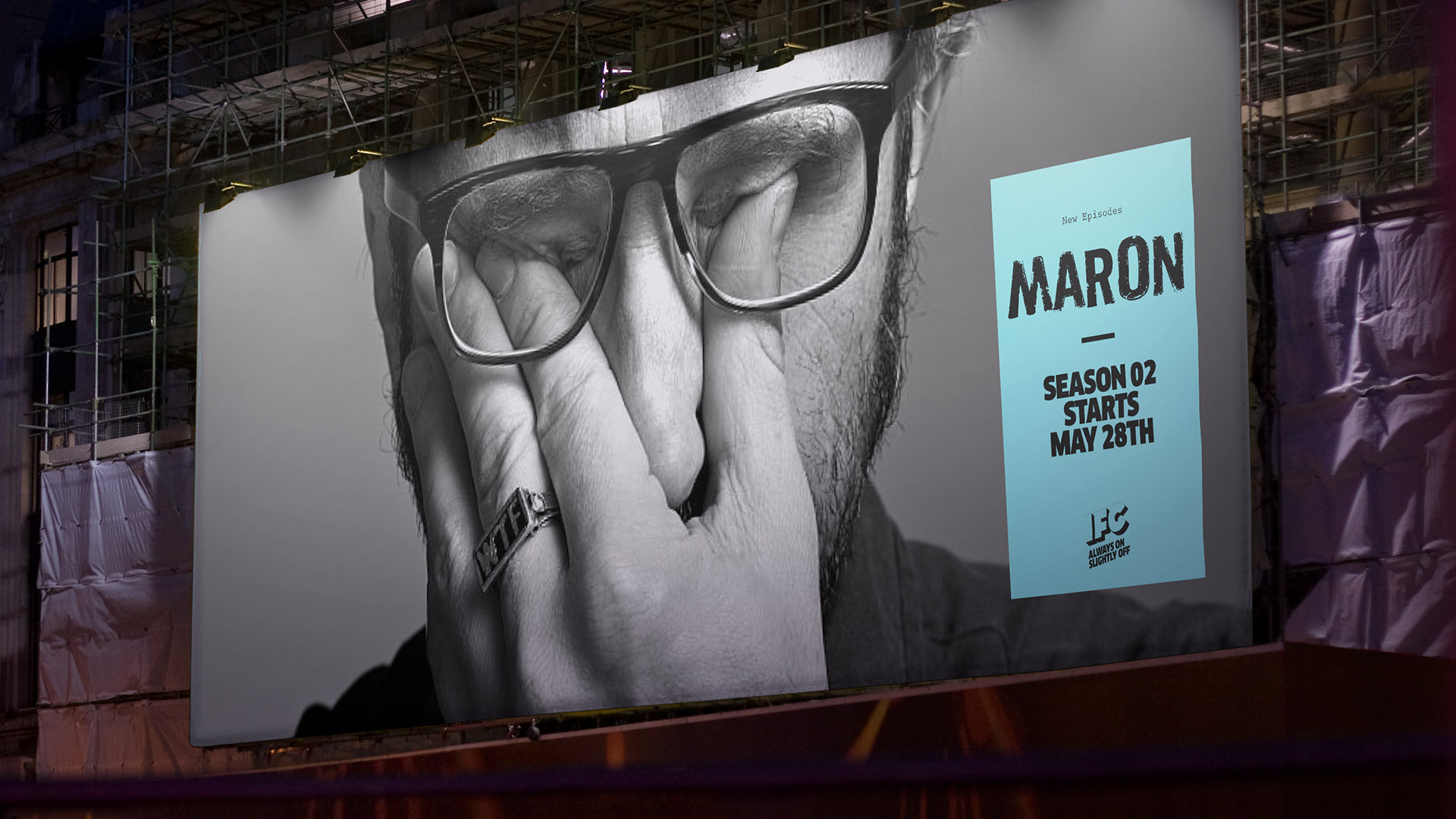
Building a brand that could translate across any platform and maintain the same visual impact was key. The clarity and simplicity of the design system scales across any medium and lets the IFC voice shine through.


