Hart Bageri
Hart + Hand
–
A hand-crafted refresh for Hart Bageri in Copenhagen
We designed the original branding for Hart Bageri when Richard Hart and the Noma group opened a single location in the Frederiksberg neighborhood in Copenhagen in 2018. With 10 locations and counting, along with a growing line of products beyond baked goods– it was time to revisit, adjust and expand the visual identity.
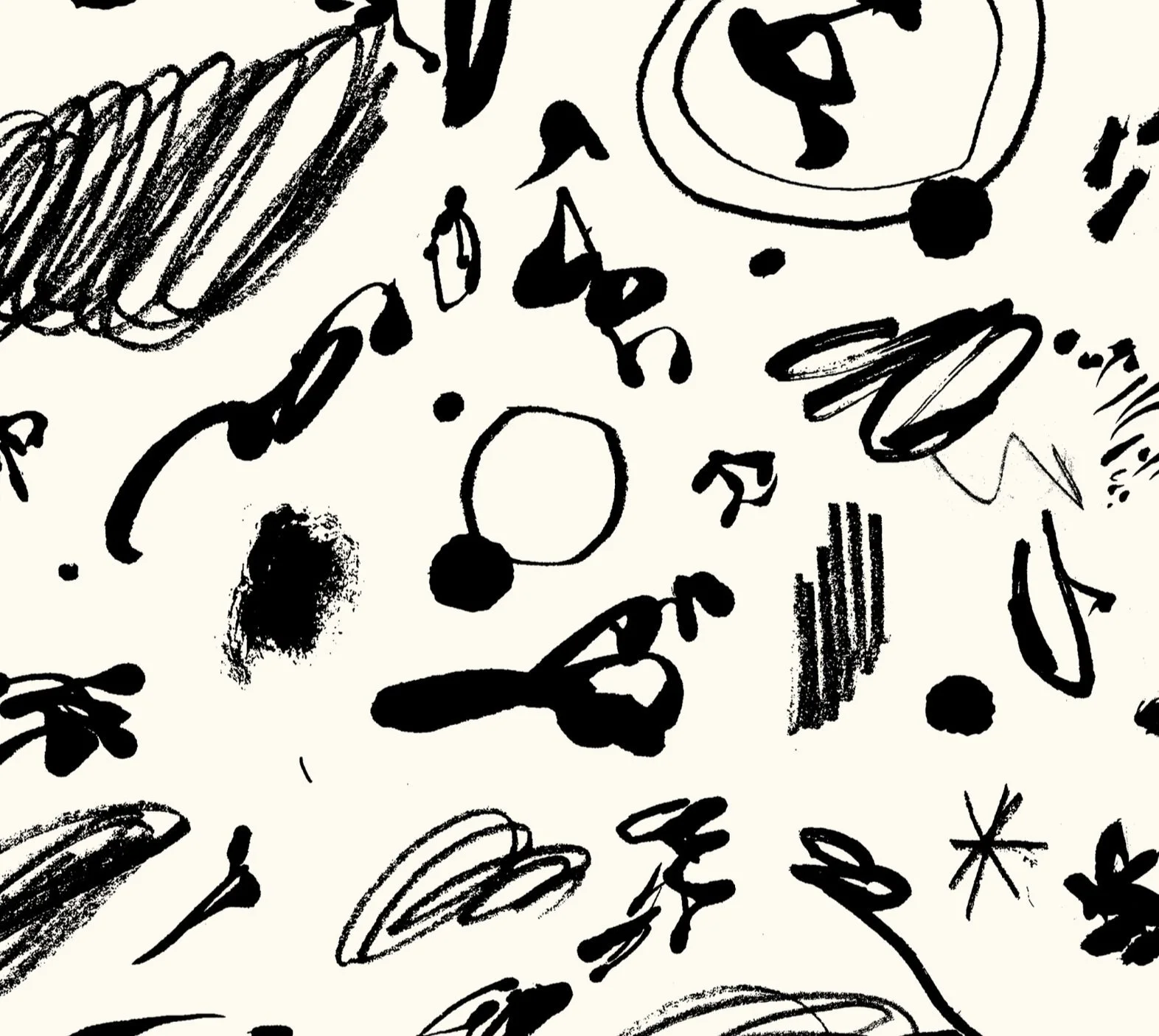
As ever, Richard brings an unexpected character and style to the art of baking– he and his crew are both disciples and dissidents, honoring rules and traditions while reinventing them. That meant a chance to re-imagine some of the hand-rendered elements in the original visual identity. We partnered with illustrator Bráulio Amado to infuse a sense of warmth, wit and humanity into the graphic and typographic language. All to help refine and re-center the hand-crafted feel at the heart of Hart.


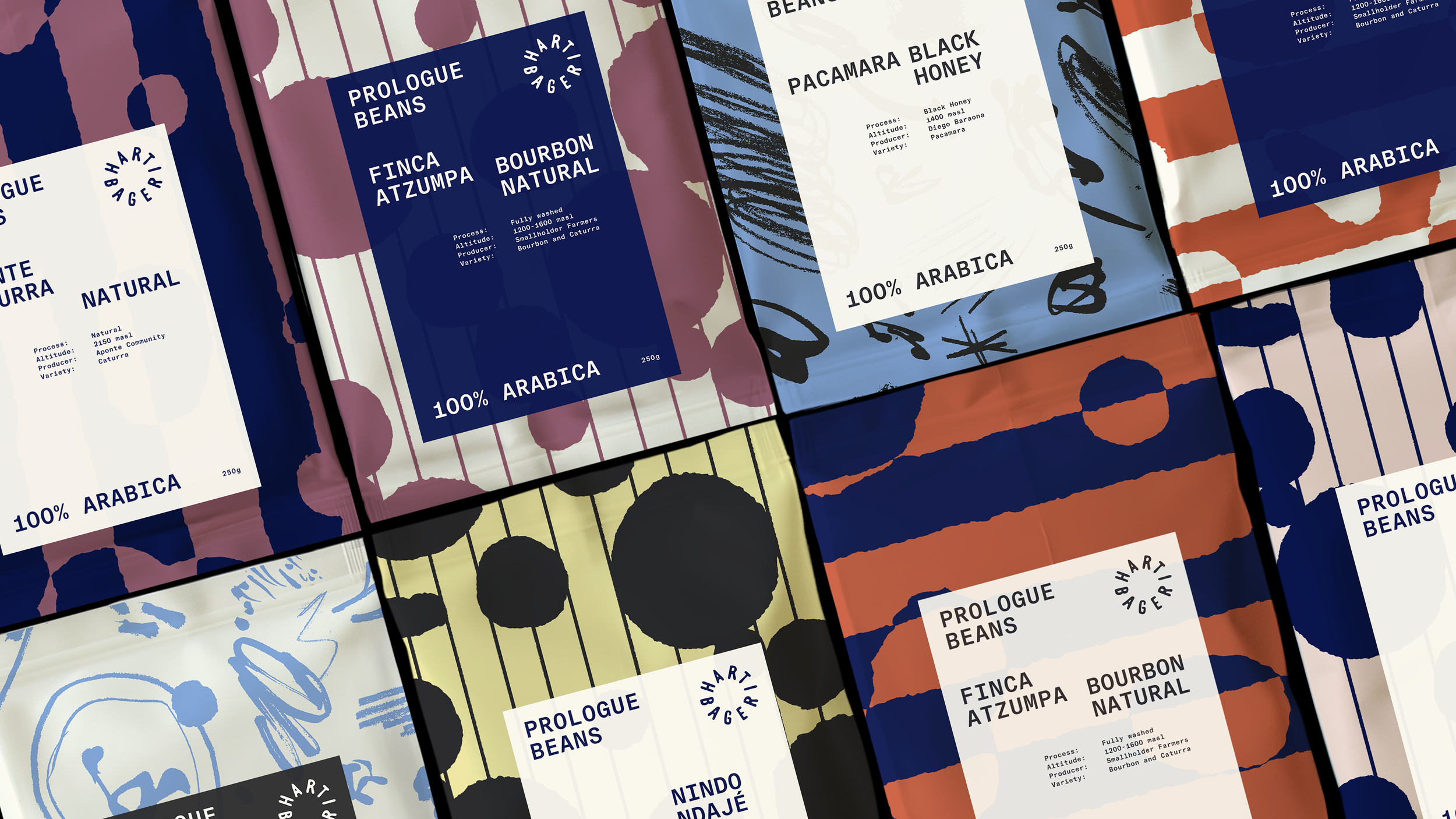


Expanded Brand Ingredients
–
In keeping with the spirit of the original brand, there is no single logo. Instead, a series of hand-drawn wordmarks add variety across applications. The hand symbol is inspired by a tattoo of Richard’s and acts as a maker’s mark to lend character and punctuation to the system.
A looser, livelier Illustration language infuses warmth and wit. In evolving the brand, we shifted to Basel Grotesk, a sturdy, hardworking typeface to maintain rigor and structure as a counterpoint to the expanded, expressive elements.
The original brand launched with a stark black and white palette. We’ve introduced a deep blue along with a limited palette of dusty, organic tints to warm things up and give more range to print and packaging.


Illustrations: Bráulio Amado for Hart Bageri
Photography: Martin Kaufmann, Gretel, Noma, Spacon & X