Centric
A Layered Identity
—
The modern black woman is complex, layered, and nuanced. So is the brand.
Centric was founded in 2009 as a 24-hour music and entertainment channel that reflected the lifestyle and sophistication of a multicultural adult viewer. While music will continue to be part of the Centric DNA, the evolution has now led them to become “The First Network Designed for Black Women” – a modern multi-platform lifestyle brand, boldly celebrating the multi-dimensional world of Black women.
The goal from the start was to create a brand with modernity, style and attitude. Our solution was to create a densely layered brand. One that felt expressive, but thoroughly modern.
Identities: Best Reviewed
In digital, print, and out-of-home, the brand makes a statement. A very close extension of the on-air package, the brand calls attention to itself no matter where you see it. Our variable recipe of palettes, logos and imagery are easily adapted to any format on any platform.
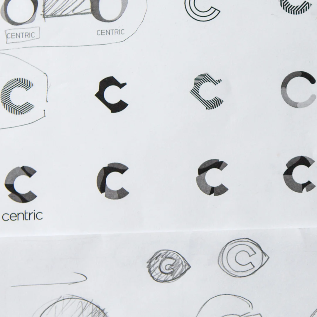
The new logo embodies complexity and variation in both its form and fill. The logo is ever changing, it can take on a range of styles and reflect an array of personalities. In certain applications where the logo stands alone, it still reflects the spirit of the brand.
Type
The type is authoritative, modern and bold. A single typeface (Neubau Grotesk) always set in all-caps and always centered in frame provides a solid anchor for an otherwise highly variable package. The type typically unifies and grounds the graphics with the least copy possible.
Photography
First and foremost, the brand is about black women, so naturally that’s where we started. Variety was key as the brand itself is so diverse. It was important to reflect the wide world of Centric in the imagery, everything from music, culture and lifestyle, to politics, fashion and sports. The poses and the attitudes are varied- some are playful, some are serious, but they’re all expressive, stylish and real. These images became the brand’s beautiful base.
Color
Expression. Life. Passion. We achieve this vibrancy through color. As with all the brand elements, there’s a range- from soft photographic gradients to bold swirls of paint. We developed an array of color stories by matching bold, saturated hues with subtle pastels and restrained palettes. Strong, but feminine.
Texture + Pattern
We crafted, rendered and shot an array of organic patterns and textures, both procedural and hand-made that lend a sense of depth to the brand. Ink washes, running paint, and and generative digital assets balance a tactile, personal feeling with precision and variability. The libraries can easily grow and shift along with the brand.
The Formula
To create an expressive, variable brand, we knew we couldn’t rely on a modular system without considerable range. By mixing, remixing and changing the proportions of thier brand ingredients, Centric can always come up with new and exciting results without deviating from the brand.


