National Geographic

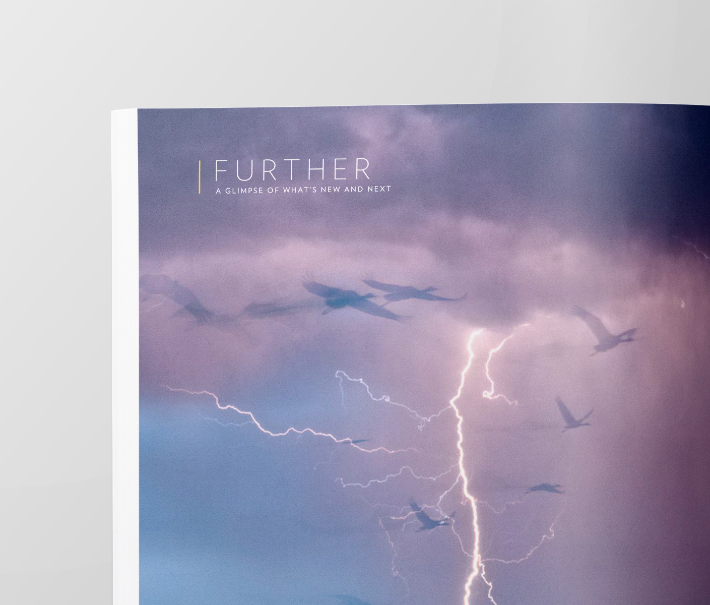
Further
–
Rethinking a legacy brand for the modern age.
From its inception in 1888, National Geographic has been about exploring the unknown, constantly pushing the boundaries of our understanding.
Since the beginning, they’ve done this by actively seeking out and illuminating the unknown corners of our world through incredible visual storytelling. Photography is the cornerstone of the brand – it’s evolving, but it’s the product they deliver that no one else can.
This was the case in the late 19th century, when the medium of photography was cutting edge (and even controversial), and it is the case now. Although the technology has changed, National Geographic still transports us through imagery. We need look no further than their Instagram account: #15 in the world, with 92.7 million followers, and the only account in the top 15 that isn’t celebrity-driven. It’s a window to the world, which has as much allure today as it ever has.


The Magazine
–
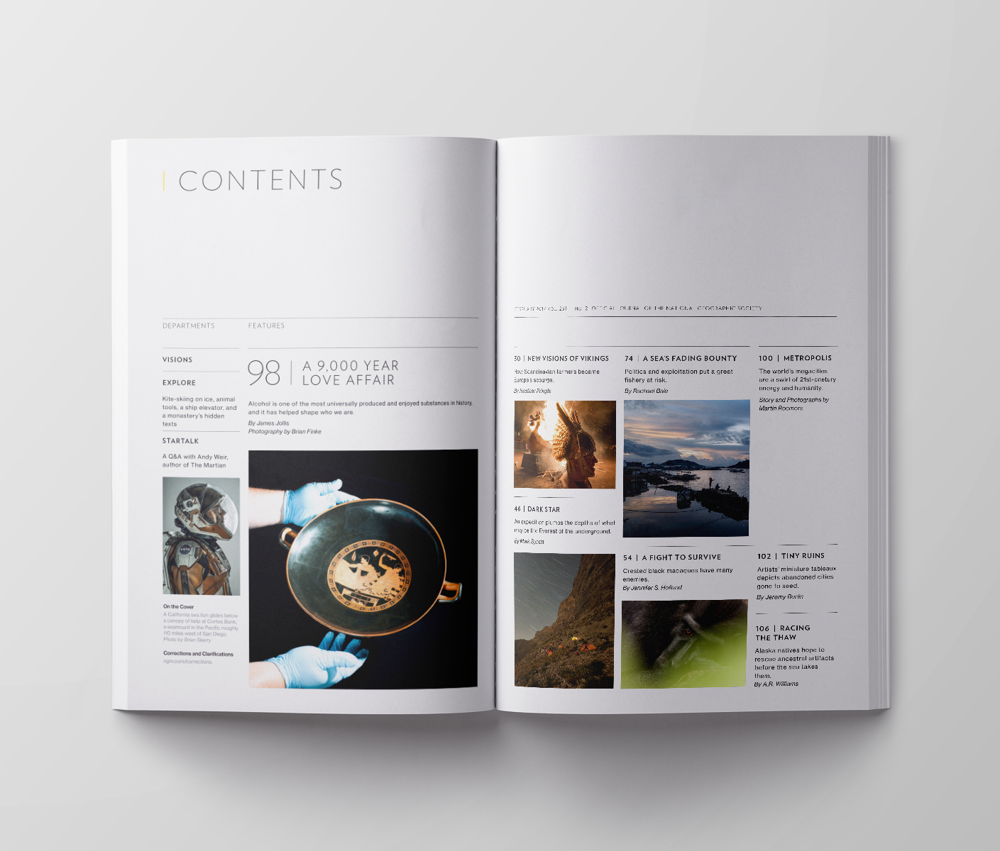
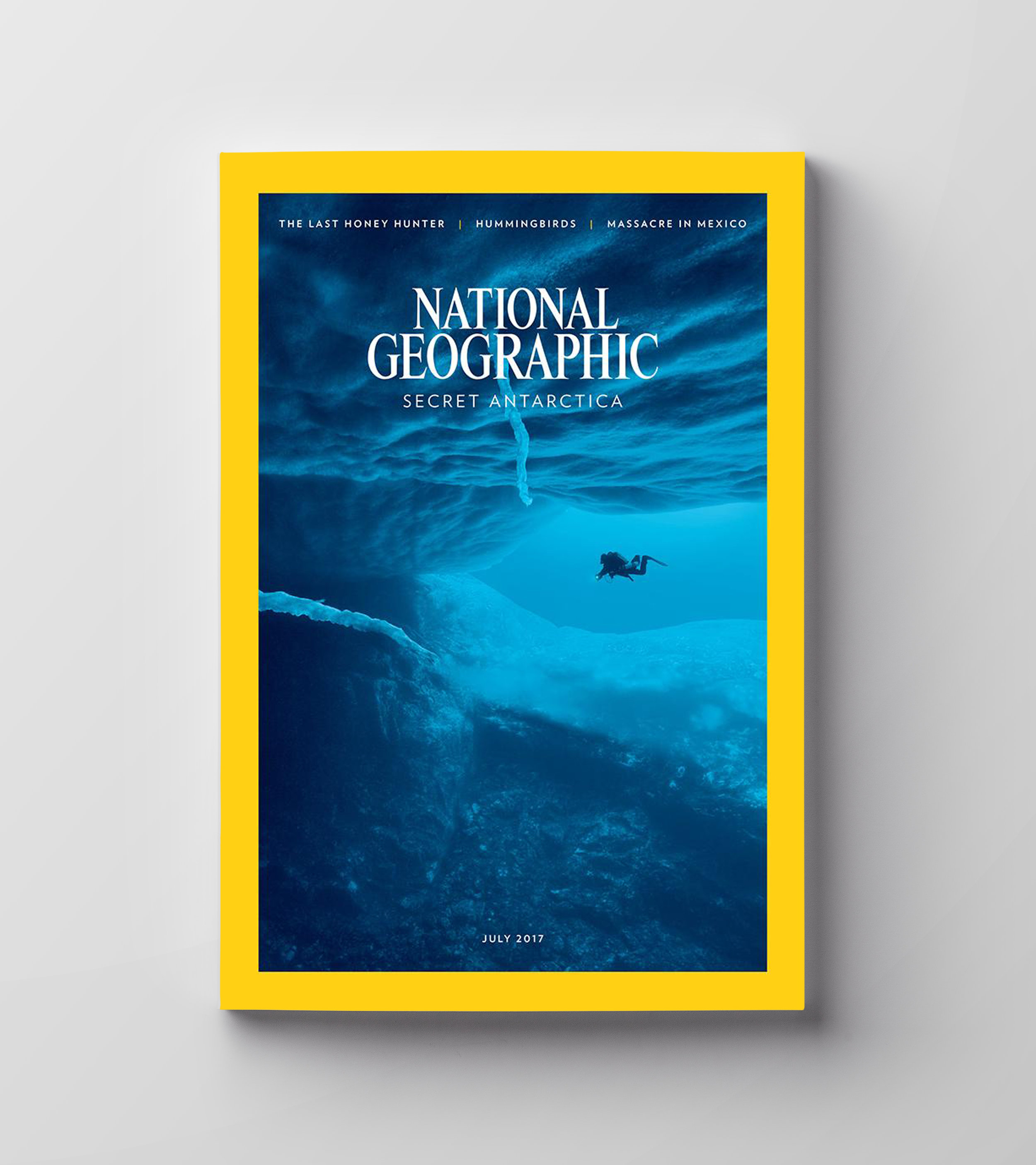
After more than 120 years, the face of the brand is still the magazine. One of the most impactful ways to communicate this paradigm shift was to refresh the design from cover to cover.
The first thing we looked at was the cover imagery and typography. The magazine had veered away from the very thing that was at its core: stunning photography from the field. In recent years, frequent use of staged images from inside a studio and elaborate type treatments – which often distracted from, or even obscured, the cover image – began to take over.
We vastly simplified the layout, bringing the cover back to a more traditional place, not simply for nostalgic reasons, but to let the photography have its due. Our belief is that a stunning photograph can compete on the shelves with some of the more over the top, loud design language that’s out there.

Global Tagline
–
We built a platform around their purpose: to seek out the unknown. FURTHER became a tagline of sorts, but really it’s a mantra, a raison d’être. It’s a thought that everyone within the organization can rally around: we are always seeking and we always strive for better. It’s also a consumer-facing notion: National Geographic will take me to the edges of the known world, and they will never rest in doing so.
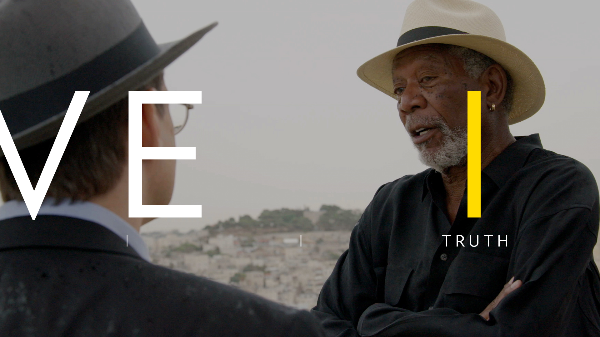
FURTHER Brand Idents Directed by Dvein and Produced by Garlic.
Visual Identity
–
Working closely with National Geographic Executive VP of Global Brand Strategy, Emanuele Madeddu, and VP of Branding and Creative, Mariano Barreiro, we developed a simple and elegant visual language that allows the photographic image to take its rightful place at the center of everything. Because the magazine has a long-standing history and tradition – and because it relies on static images – we made sure that the identity is pure.


“What began as an exercise to simply overhaul the look and feel of the channel has now become a comprehensive rebrand of every single National Geographic consumer touchpoint.”
Courtney Monroe, CEO, National Geographic Channel
Motion Language
–
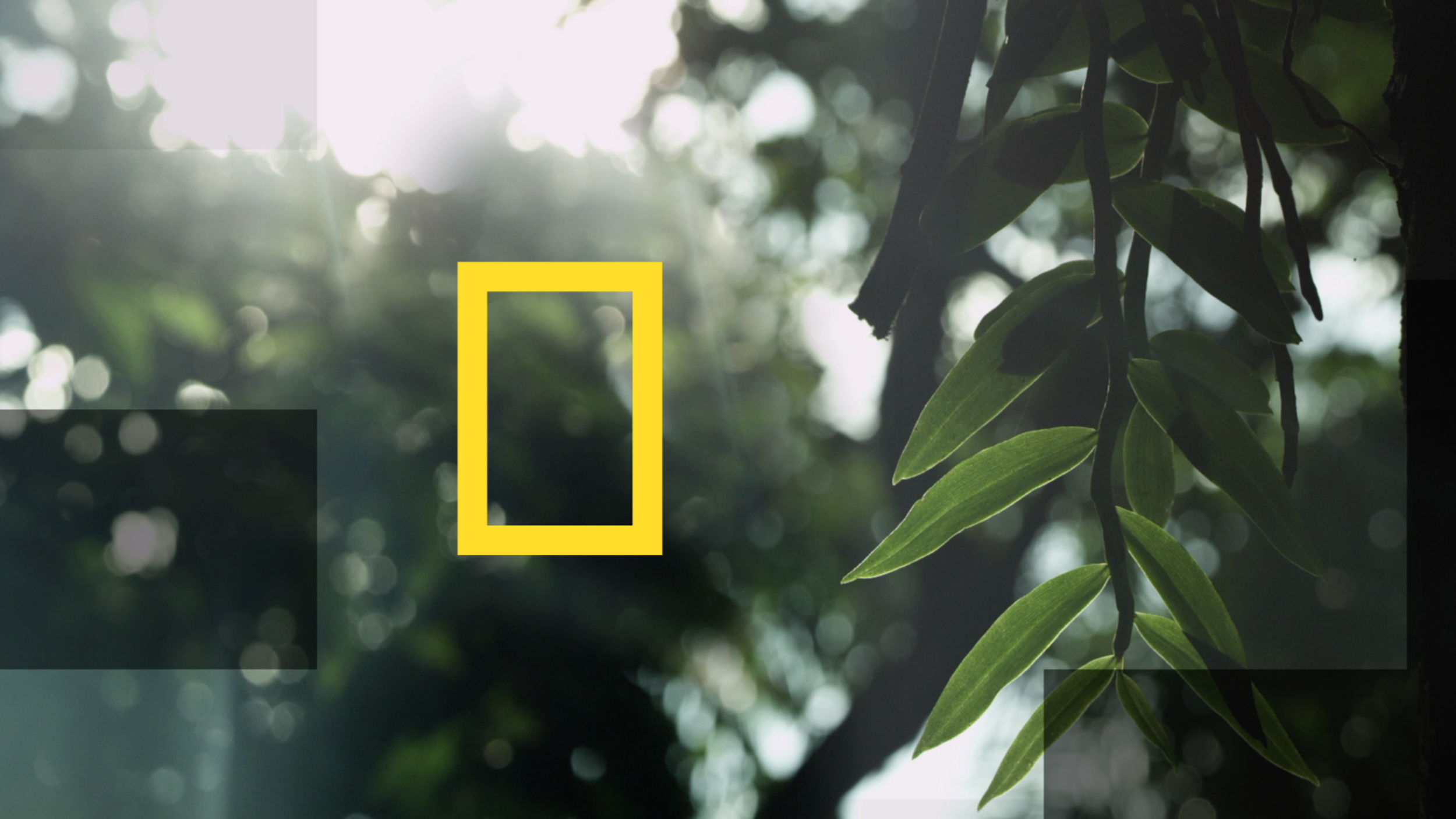
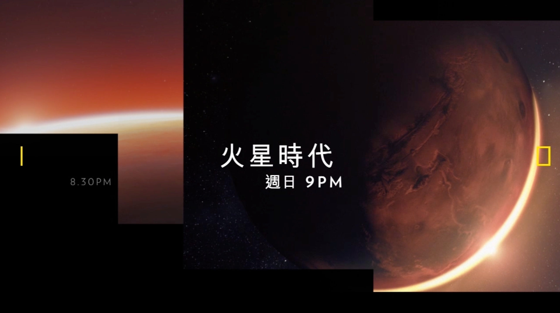
In digital and moving images, we add to the language, relying on two simple devices, pulled from scientific exploration: The Index and Mapping.

Mapping is the process of combining bits of known data in order to form a more complete picture. We borrowed from this language to emphasize the theme of exploration. It also gave us an inherent motion language, in which images can reveal themselves by softly tiling into place.
We only move forward along the X-axis and we never stop, we only slow down. The Index is a continuum; it has no beginning and no end. Just like the network, we have our eye on the big picture and the gritty details. Units can be contextual to specific shots and shows (atmospheric density of Mars, Nautical miles between tuna boats, Arctic temperatures), or just deliver primary and secondary messaging.